113 Scumbling & glazing

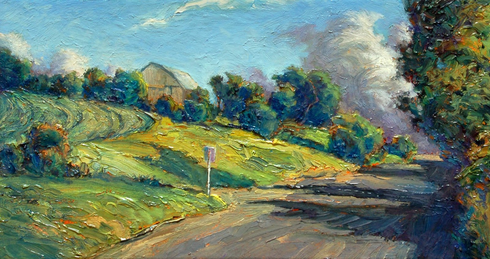
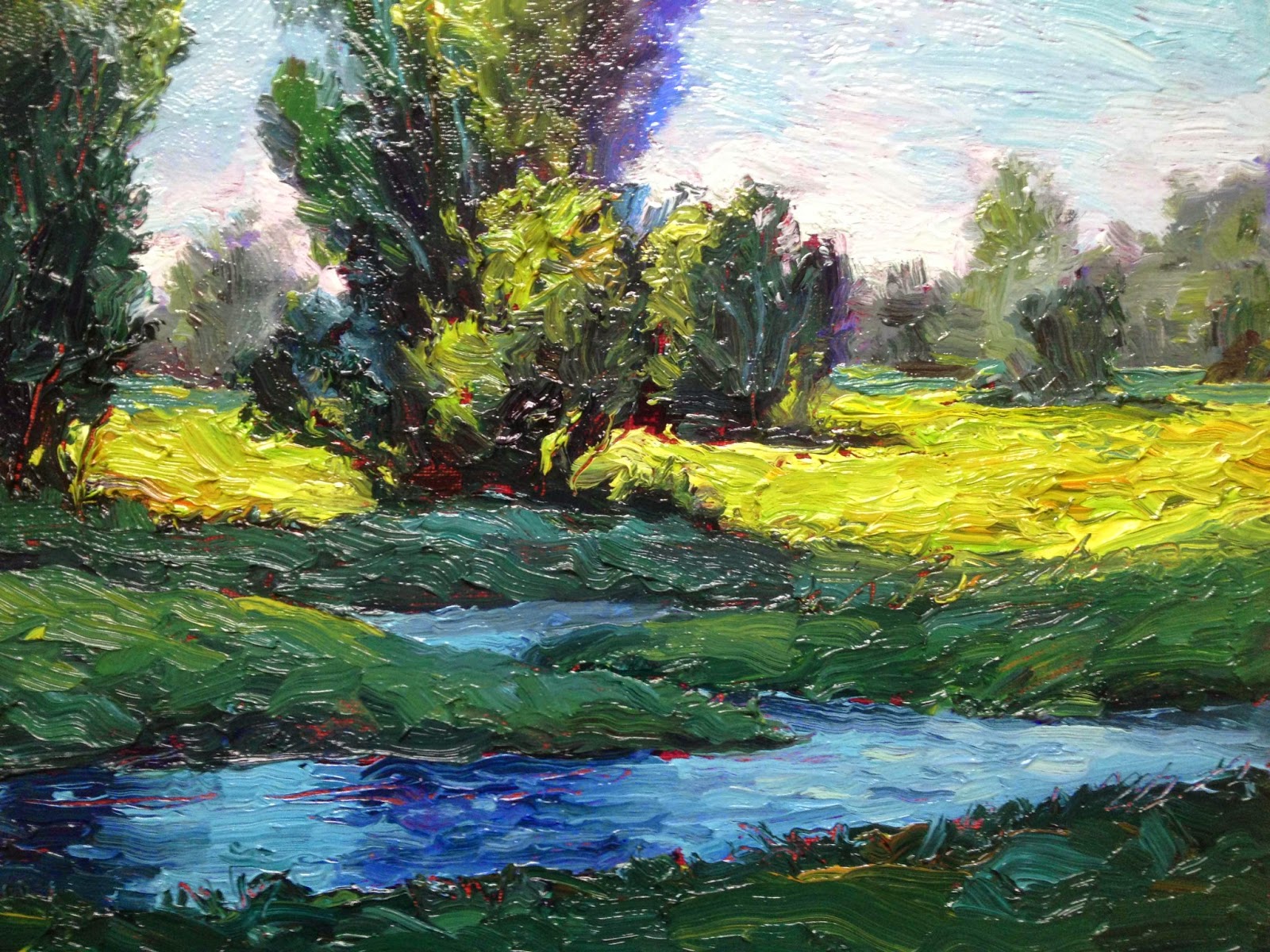
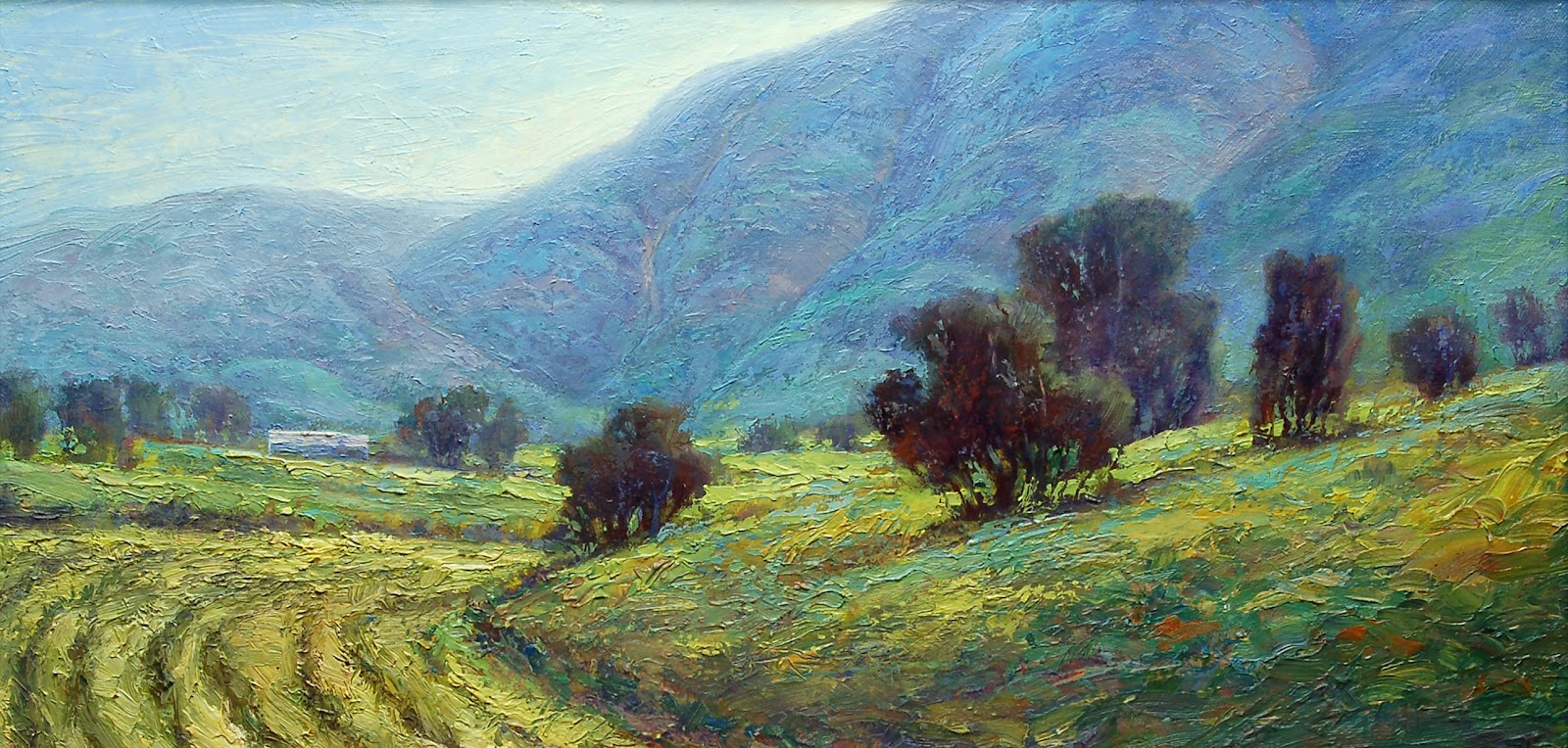
I enjoy painting alla prima and my best paintings are painted in one session with a minimum of adjusting after they dry. However, nearly all paintings can benefit from some minor adjustments using scumbling and glazing. Used correctly these two related techniques can give startling results. Watch the following video to learn some of the best practices regarding these intriguing techniques.

Brad Teare April 2013


114 New book, Digital version

When I published a hardback collection of paintings and woodcuts with Blurb I noticed I could also publish digitally with them (see it here). I hit the button to convert the book and was led to an online editing program. It seemed fairly straightforward but my custom fonts and other custom design elements didn’t translate well.


I decided it would be best to reformat the book. Using InDesign I changed the font to Times and reflowed the text to eliminate wrap-arounds. I felt the overall effect was somewhat diminished so I added two of the most popular Thick Paint videos (Loading the Brush and Getting Greens Right, which together have over 75,000 views).

By selling the book on Blurb the digital book was automatically uploaded to the Apple iBookstore (see it here). It sells for $4.99 and is available on iPhone, iPad, or iPod touch. I suspect the ideal device to view it would be the iPad. But I don’t know since I don’t have an iPad yet. If you download it for the iPad let me know how it works. I’m especially curious about the videos.

Many thanks for the positive emails I’ve received recently. They keep me going! It looks like its going to be a beautiful Spring. I hope to have some videos about painting en plein air soon.

Brad Teare April 2013


115 The art of the sketch

Doing a preliminary sketch is one of the best ways to insure the success of a painting. In the video below I focus on keeping the design of the sketch strong by using three value zones. In this case I kept the sky and water as the lightest zone, the ground plane as the middle value zone, and the trees, shadows on the embankment (which read as upright planes) and the reflection of the trees as the darkest zone. Try it and see if it works for you.


Brad Teare April 2013


116 Add Paypal “Buy Now” button

I recently read the book Digital Disruption. The basic premise is that the economy has changed dramatically, which everyone knows, but few realize the positive nature of this change. The book posits that we no longer live in a capitalist society, that is, a society where those who control capital control the economy. But rather we now live in a society where the economy is controlled by those who control knowledge and information. Previously it took money to make money. Now it takes knowledge to make money. Why? Because technology has pushed the cost of production so low that virtually anyone can use technology to promote their ideas with little or no capital. Createspace, Blurb, and Graphicly are manifestations of this new, evolving economy.

In previous blogs I mentioned experimenting with the above services as well as with Etsy and Wix. Wix is a website creation site with a shopping cart option. But the option costs $16 a month. Cheap, but not cheap enough. So I looked around and discovered that PayPal has an option to add a buy button to a website or blog that costs nothing up front. There is a deduction from the transaction. Few people seem willing to mention how much this deduction is, perhaps it fluctuates, but they claim it is nominal. I’ll find out and report back. If the deduction is steep enough it might be better to go with the Wix shopping cart as they deduct nothing. I will experiment with the Paypal button and switch to a Wix shopping cart when sales warrant (that is, when Paypal deductions add up to more that $16 a month).

I was surprised how easy it was to set up the button with Paypal. Although it was disappointing I had to charge for shipping. Free or no charge wasn’t an option so I made shipping $1 (I prefer to include shipping into the price of the item). I didn’t have any paintings in an appropriate price range (it’s difficult to imagine someone buying a painting for thousands of dollars via a Paypal button) so I made a button for my 9 value grayscale. It is like the one I use in my videos and it might save some from having to purchase all the grays from Golden Acrylic.

To buy a 9 Value Grayscale for $5 plus $1 shipping click the button below:

Many thanks! I will share the results of this experiment in a future blog.

Brad Teare April 2013

117 The unexpected power of Blurb

As I mentioned in an earlier post I recently published a collection of paintings and woodcuts with the on-demand publisher Blurb (see preview below). I felt such a book would be an excellent gift for collectors as well as a compelling way to tell my story in a gallery setting.


I’ve since had the pleasure of giving it to two collectors. The gift has been well received and I derived the satisfaction of giving back to those who make my career possible. The Southam Gallery displayed the book at a recent opening and I had the best one night sales I’ve had in many years. I attribute at least some of that success to the excellent printing and presentation of the Blurb book.

These benefits were hoped for but not unexpected. What I didn’t expect was the influx of blog readers via the Blurb site. Apparently Blurb attracts a lot of readers of fine art books. Blurb is my top traffic source this month and, amazingly, is currently the third most frequent traffic source in the history of my blog. The increase in readership due to publishing with Blurb was a complete surprise. I’m not naive enough to believe the trend will continue nor that traffic stats are the sole measure of value. But in the weird world of the internet numbers are often the difference between nominal success and wild success.

I pass these observations along to those who might be contemplating doing a book with Blurb but have yet to determine if it would be worthwhile. From my experience I highly recommend it. In fact, I plan on doing a new book whenever the volume of paintings warrants a new publication.

Click this link to begin your own book and get $20 off. Let me know if you experience similar results.

118 Dubai debut

I was honored to be featured in the art and design section of the May edition of Gulf Connoisseur magazine. Gulf Connoisseur, published in Dubai, is the premier lifestyle magazine of the Gulf region. It was a pleasure to work with Meena Das Narayan, the editor-in-chief and publisher. In addition to her duties at the magazine she is a filmmaker, painter, and poet. She did an excellent job showcasing the paintings as well as writing the article. I take my hat off to both her and her staff.

Take a look at the English online version here. To view my article type in 126 in the small rectangle at the bottom of the page. That will jump you to page 126, the intro to the first page of the article. Or you can use the contents button (on the left) to go to the article Imprints of Impressionism.


The magazine has extremely high production standards. I was surprised the magazine was printed at 350 dpi (most publications print at 300dpi) but the results were well worth it. The magazine has a sumptuousness that few American magazines achieve. The paper quality is exceptional and the colors are amazingly accurate. The magazine is published in English, Arabic, and Russian.

It was an honor to be included in the 10th anniversary editionI hope you enjoy the magazine as much as I did.

Brad Teare May 2013

119 Studio tour

In my continued effort to leverage digital communication Im currently making what I hope will be an entertaining multimedia website using Wix.

Wix is a HTML5-based site building tool that promises to be an inexpensive alternative to other website creation options. The main problem with my previous website was it didn’t fully communicate the unique aspects of my artistic project. In order to deepen communication I need to fuse the best aspects of a website with the strengths of a blog.

The days of posting a site with your name and image linking to a series of stamp-sized paintings are over. At its best a website should explain your artistic project in as many ways as possible as clearly as possible. Adding the social media of a blog increases the site’s potential. On my new site I plan to have this video as well as audio clips to further explain how and why I paint landscapes the way I do. Each page will also include various social media apps allowing for user feedback.


Many claim we are in a communication revolution. It follows that those who communicate the best will prevail in this revolution. I made the following video in the hopes of better communicating the scope of my artistic project thereby successfully expanding that project.

Let me know what you think.

Brad Teare May 2013

120 Learning by teaching

I recently finished teaching an illustration course at Weber State University in Ogden, Utah. I’ve heard teachers say they learn more than their students. It was true in my case and I found my painting improving significantly over the semester. As I reflected on why the teacher learns more than the student I realized it was the first time I consciously formulated the most efficient steps to artistic improvement.

In the process of encouraging my students to embrace basic principles I experienced a broader appreciation of those concepts. As I shared my ideas they came into sharp focus in my mind and the distance between knowing and understanding diminished.

As I taught I wondered if my students would grasp the importance of what I was trying to teach them. Would they too shorten the distance between knowing and understanding? Because of this worry I found myself repeating basic concepts over and over. And I asked myself, do I practice these principles as well as I should? The answer, unfortunately, was no. But the process of teaching was a powerful reminder that we all need to periodically recommit ourselves to basic principles.

What were these basic artistic principles?

The value of design

Even when painting a complex realistic painting it is essential to have a solid, basic design. The bedrock of design is ensuring visual interest by interlocking three values zones; darks, lights, and grays. Any composition that has an interesting pattern of interlocking values will have the backbone of a good composition. There are other elements of composition such as the power of the edge and of the center but they don’t rival the power of three interlocking values zones.

The value of the thumbnail sketch

A basic human tendency is to overestimate our abilities. This is readily apparent when we assess our ability to imagine. It is always worthwhile to give our imagination an assist by doing a lot of thumbnail sketches. There are subtleties that will be resolved as you express your imagination by drawing. Drawing a lot of thumbnail sketches is the best investment you can make in the future of your painting.

The value of daily sketching

I made my students draw a sketch a day in their sketchbooks. This was universally decried as excessive. I stuck to my guns. As I tried to keep up with my students by drawing everyday I rediscovered its vital importance to foster the basic skills of being an artist. I found my imagination enhanced, my manual skills revitalized, and my confidence increased.

I’d like to thank my class for helping me to rediscover these vital principles.

Brad Teare May 2013

121 Experimenting with paint

I’ve been experimenting lately with abstract painting. I find it an excellent way to focus on design and color. I think of my abstract painting experience as my paint lab. It’s an exciting way to try new color schemes and to relax and let the paint do the painting. I got the idea for these thicker oil abstracts while taking closeup photos of my realist landscape paintings to show the broken color. I loved the profusion of intermingled color without the distraction of reality. Each square inch looked like a large abstract painting. For more info on painting with broken color go here.

One downside to painting with extremely loaded strokes of color is that you use a lot of paint. In the following video I used paint from RGH Artists’ Paints, a source fellow painter Robert Britton, Jr. recently wrote about. Robert did an analysis of cost and color comparison of RGH paints here.

I found the RGH colors vibrant, thickly textured, creamy yet opaque. I bought a nice assortment of colors and in the future I will be reordering this excellent paint. If you need lots of high-quality yet reasonably priced paint I highly recommend this company.

Brad Teare 2013

122 Working toward the center

In this latest abstract, The Center Will Hold, 24″ x 24″, a large landscape was sitting behind my easel as I painted this new piece. I was shocked by the contrast between the two methods of painting. The abstract was fresh and bright. The landscape by comparison appeared gray, washed out, and the brushstrokes seemed uncertain. It was a sharp reminder that one of my major goals in landscape painting is to get the kind of freshness I’m currently getting in my abstract paintings. It also reinforced my conviction that taking time to develop the abstracts is an excellent method to reinvigorate my landscape paintings.

The abstract project is legitimate on its own terms. It will also prove to be an excellent way to explore more color and texture possibilities which I can later incorporate into my landscapes.

In a past post I called these abstract experiments my color lab. I think the description is apt.

Brad Teare May 2013

123 Reducing costs

When painting with thick paint, when layers can be half an inch thick, it’s important to have access to good quality, inexpensive paint. In a recent post several readers made comments that alerted me to sources of very inexpensive supplies. I checked the sources and discovered they were much cheaper than the supplies I have been using. I review these price saving sources and tips in the following video (with links below).

Over time I will expand this blog entry to include other inexpensive painting supplies. I hope you will make comments and let me know of any alternative sources you may know about.

Inexpensive paints in tubes, jars, cans, and dry pigments: RGH Artist’s Oils
Stretched canvases up to 30″ x 40″, gallery wrap in two thicknesses: Artist Brand Canvas
Canvas in rolls: Allens Canvas
G-gel, alkyd painting medium: Gamblin Colors
Burnt Plate Oil #8: Graphic Chemical

If you order from RGH Artist’s Paints please mention my name. I appreciate your support.

Special thanks to Robert Britton, Jr., Robert Votch, Steve Ladd, and Mark Robison.


Brad Teare June 2013

124 Between earth and sky, 40″ x 30″

I painted this large abstract from a small 8″ x 8″ color study I painted with oil sticks from R&F Handmade paints. This was the first time I’ve painted an abstract so large and it was somewhat daunting. I used the rest of my Indigo Blue I ordered from RGH Artists Paints. It was a 250ml jar which I used on just two paintings so I am getting the paint on plenty thick.


The photograph is lacking. It seems the bigger the painting the harder it is to photograph. I actually ordered a light tent as recommended by Robert Britton, Jr., but realized it would take up most of my studio so I hurriedly canceled the order. I will wait until I expand my studio to reorder.

The paint will be wet for a month or more so I have plenty of time to make changes if necessary. Right now I’m thinking perhaps the bottom green section is too green. I’ll sleep on it and see how I feel tomorrow.

Brad Teare June 2013

126 Loading your own tubes

As mentioned in previous posts I’ve been buying paint in bulk from RGH Artists Oils. With my last order I ordered all pigments in pint jars (473 ml). I like the jars because it is easy to use a spatula to scrape the paint out. Using the spatula I can keep the surface of the remaining paint flat which dries slower. If I’m still worried about drying I can add a few drops of walnut oil to seal the top layer.


Fellow artist Steve Ladd suggested buying in bulk or making your own paint from dried pigments and tubing your own paint. He places paint onto a piece of aluminum foil which he then rolls into a tube. The foil tube is then placed within the empty paint tube. A roller is then used to squeeze the paint from the foil into the tube (I use a brayer used in block printing). The slanted board helps the paint fill the tubes without bubbles but is not absolutely essential. I include some photos Steve made to illustrate his methods. (Click here for cheap tubes: Jack Richeson 150-Ml Empty Paint Tubes, Case of 144).


Photos of tubing process courtesy of and copyright by Steve Ladd © 2013

127 Painting a small landscape

In this video I paint a small 8″ x 10″ landscape using a purple couch (or layer of medium). I used a colored couch because it imparted the purple hue into all of my colors giving a unified color scheme. Purple is a good color to use in a composition with a lot of green because it tends to mellow and harmonize the greens. I used Cobalt violet because it is a very weak color. If I had used Dioxazine purple or Carbazole violet the couch probably would have been too insistent and would have overpowered the other colors.

Note that in order to add some more texture to the foreground (after erroneouly eliminating some really sweet strokes) I added the feel of texture by scraping into the grass and embankment with the end of my brush. You won’t see this in the video but you will see the final results in the photo in the upper right (click it to enlarge).


Brad Teare June 2013

128 Finding a style

When we say artists have found a style it means they have arrived at a decision about their artistic expression. Style encompasses technique, composition, and attitude. It is an expression of your personality. In the best sense finding your style implies self knowledge fused with a technique that best expresses that individuality.

I know artists who thought little about their style, about technique, or the ultimate expression of their painting. These artists seem to know exactly who they are and their paintings reflect their confidence. Although I’m often envious of such confidence I find it completely alien to who I am. I’m more inclined to view such confidence as bluster, or worse, as thoughtlessness at the complexity of the world. What some view as lack of confidence others esteem as introspection.

Whether good or bad my journey has entailed a lot of experimentation, introspection, and self doubt. But those who know me well know that such a journey itself is an expression of my personality, my true nature. There might be those who would suggest some kind of self-help program to bolster my confidence and I have no aversion to self improvement of any kind. But I’m equally opposed to any type of fakery when it comes to evolving personal style. I’m unwilling to embrace a feigned confidence at the expense of genuine introspection.

I’ve known those who simply adopted a style, who copied the techniques of their favorite painters. I’ve known artists who faked a style, embracing the most popular fashions of the moment. These are common solutions for students and I don’t condemn anyone for trying them especially in the absence of alternatives. But feigning a style is not a real solution because there is no discovery of self. An adopted style is not a style. Any expression that is not a manifestation of who you really are is not a style. It is merely a pose. 

When asked if there is a shortcut to finding a final style I’m forced to confess that there is no easy way. There are shortcuts to technical proficiency and technical proficiency is a component of style. But the only way to find a style is to discover a method that best represents your personality, your intellect, and your view of the world. Those who copy a style or feign a style are simply postponing discovering their true style. How your style evolves is an aspect of your personality. It proclaims how you are developing as an artist and a human being. This process cannot be manufactured.

Brad Teare July 2013

Si quisiera hacer una pregunta en español por favor hagalo. Hablo castellano.
X