97 Thick Paint in 53 languages

I was thrilled that Google recently made universal translation available for blogs. I immediately added the button to my site. You can find it at the top of teh page on the right.

The main reason I write this blog is to help artists who may not be able to easily find the resources they need to be the artists they dream of becoming. Additionally it is a tragedy that parents, teachers, and would-be mentors  might not be able to find the resources they need to help their students excel. I made this blog as an evolving resource for art students everywhere. I am extremely glad Google has made it possible for this information to be translated into 52 additional languages. Thank you Google!


I speak Spanish so was curious to test the accuracy of the translation. I rate it as extremely good. If you are reading this blog in a language besides English please add a comment and let me know how the translation experience worked for you.


Please share this with your non-English speaking friends. Many thanks!


Brad Teare May 2012

98: Natural gifts vs. acquired gifts

THERE IS A POPULAR THEORY that has been around for a while called the 10,000 hour theoryIn his book Outliers author Malcolm Gladwell writes that people who achieve incredible success have one thing in common: they spent at least 10,000 hours learning and perfecting their craft. Dan McLaughlin, a professional photographer from Oregon, decided to put the theory to the test and committed himself to 10,000 hours to master golf and hopes to become a PGA golf champion. McLaughlin, who had never picked up a golf club, calls his endeavor The Dan Plan and is now sponsored by Nike and is shooting a documentary about the experience.

I think it’s possible, especially in the field of sports, to invest 10,000 hours and radically improve your ability. But in the case of art, especially painting, I’m not as convinced. I recently took a year off from painting. When I came back I found my abilities vastly improved, especially my plein air painting. What does such an unexpected development mean to the 10,000 hour theory?

Not painting for a year yet improving means there are other factors besides the brute force of putting in the hours. Acquiring the proper knowledge can vastly accelerate learning. It is one reason I started this blog; to help painters radically diminish the 10,000 hour investment. 10,000 hours is just too much time, especially for people such as myself, who started painting later in life.

I have probably learned more than anyone by writing this blog. And I really appreciate all the thanks I’ve received. It’s one of the reasons I’ve returned to the Thick Paint project (although I am still working on my commercial project).

I recently purchased a software package to write novels and screenplays called Storyist. One amazing features is you can write a book and with a few clicks publish to the Kindle. This feature prompted me to start writing my own book about Thick Paint. Amazon allows authors a 70% royalty if the price of the book is between $2.99 and $9.99. So I am planning to offer the book between those price points. My goal is to provide information for a reasonable price to painters who might not be able to get information elsewhere.

Let me know what you think of this project. I look forward to hearing from you.

UPDATE: I never got that Kindle book written but you can read what I have so far free here.

Brad Teare September 2012

99 How to sell paintings Pt 1


SELLING PAINTINGS is not easy in the best of times. But there’s one sure way to sell paintings; create paintings other people value. Note that I emphasize creating paintings other people value. It’s pointless to pretend you’re a frustrated genius whose work is unappreciated by the masses. The immutable fact is that the final arbiters of financial success are other people.


To create valuable paintings you must embrace authenticity. If you’re trying to paint like your favorite artist your paintings will not be fully valued because your story will be the story of an imitator following the path of an innovator. A distinctive style indicates a unique way of viewing the world. That style is an expression of a unique personal history. To imitate is to adopt an inauthentic story.


Some people claim that the foremost art form of our era is story. The case can be made that the preeminent artform of all eras is story. Artists that became respected and prosperous during their time were painters whose stories reflected the uniqueness of their era. I’m not suggesting that we invent a history. But it’s helpful to understand how successful artists became successful. Think of the artists you admire. Is their artistic journey interesting? Is there something unique about them and their art that allows them to position their art above the rest? 


I admit that I don’t fully celebrate this somewhat off-putting reality. In a perfect world the validity of art should be independent of history. But there’s something incredibly naïve about such an attitude. It’s very possible that my personal journey will never be interesting enough to warrant my art being appreciated at the level I would like. But that in no way relieves me of the necessity of understanding the forces at play. What we understand we are more likely to control. We can use such understanding to our own best interests should we so desire.


Read any news source to witness how modern celebrities and superstars manipulate story to promote themselves. Celebrities embrace a sense of drama and their public lives are more theater than reality. Thankfully visual artists have a different tradition and history. Our collectors expect a different kind of story (perhaps more akin to an olympic athlete’s). But the fact remains that every successful artist from Da Vinci to Rembrandt to Van Gogh to Odd Nerdrum has a unique and inimitable story.

Read part 2 here.


Brad Teare August 2012


Read free online book about painting with free video here:


Read my story here:


100 Painting with paint

I‘VE USED THE EXPRESSION paint with paint many times in this blog. What I mean is the paint brush should be a means to apply paint not a means to scrub paint into the canvas, obliterating the fresh texture and complex color. It is the same with the palette knife. Use the knife as a means of delivering paint. Try to avoid applying paint in a scraping fashion. Remind yourself you are painting with paint.

Recently I have found myself applying nearly all the paint with the knife, at least in the preliminary phases of the painting (which in the case of plein air painting is nearly the entire session). I then might go back and add texture to the thick passages by carefully stroking with a bristle brush. I do this to relieve the monotony of texture the knife too often imparts.


It’s an interesting effect, one that can be over done. But the knife is fast and efficient, two great traits especially when painting outdoors. I’ll do an upcoming video on painting primarily with the palette knife.

Let me know what you think of the new logo.

Brad Teare September 2012

101 Palette knife en plein air

LATELY I’VE BEEN painting en plein air with the palette knife. I don’t use the palette knife for the entire painting. At the right you can see a painting I did a few weeks ago where I used a palette knife on the first 90% of the painting. At the the very end of the session I went in with a bristle bright and gave texture and direction to the knife strokes (click the painting to see enlarged strokes).

Rather than painting with a brush in my right hand while loading it with a palette knife in my left (like I normally do) I simply held the knife in my right hand and picked up paint mixtures and applied them directly to the canvas. This allowed for a very quick application of paint (always a good thing in the field). Additionally, this method allowed me to focus on major value shapes and to apply those as flat value zones and it encouraged all of the initial lines to be very hard. In other words, it remedied my major faults of painting en plein air; not focusing enough on value zones and allowing edges to become too soft.

I don’t think that using the palette knife exclusively in plein air would be satisfying to me. I enjoy the direction and texture of brushstrokes too much. But choosing the right tool at the right time can force a painter to focus on the important task at hand, reserving concern for texture and line quality until the end.

Give it a try let me know how it works for you.

Brad Teare September 2012

102 The long view

I WAS RECENTLY READING a book about the landscapes of Gustav Klimt. I was intrigued to discover that he often used a pair of opera glasses or even a telescope to flatten the landscape as he painted a distant scene.

A few weeks ago, during one of our frequent days of smoky atmosphere caused by a series of fires out west, I passed a very prominent rock outcropping along the mountains near Willard, Utah. This particular peak is very beautiful and I’ve been tempted to paint it many times. It has that postcard look that too often spells disaster should I try to paint such a picture-perfect scene. However, this week the smoke had caused a veil of white to drop over the distant mountains enforcing a subtle simplicity onto a very complex scene. In the near distance a cluster of trees didn’t show the same atmospheric effect. Their colors were bright and clear. But as I positioned myself so the trees superimposed themselves over the simplified background of distant rock I got a glimpse of the perfect motif.

This experience demonstrates that simplification can often lead to a superior painting. Imagine those rich light and dark greens of the trees superimposed over the distant purples and pinks now rendered sublimely pastel by the veil of smoke. I’m not a fan of forest fires. I consider them a plague and in many ways our summer was marred by the multiplicity of fires. But in this one case it showed that beauty is found where you find it.

Brad Teare October 2012

103 Great painting book

MY BIRTHDAY FALLS NEAR THANKSGIVING and my favorite gift is an art book. This year I received Leconte Stewart Masterworks. Leconte was a huge influence on my work, along with Van Gogh, and I was really looking forward to this edition. The book is jammed with fantastic reproductions and, needless to say, I was thrilled to get the book. Read my review here.

This book will be a great companion to my William Wendt and my Edgar Payne books. If you are a landscape painter, especially if you paint in an impressionistic manner, you need these three books in your library.

Brad Teare 22 November 2012


104 How to learn to paint

I RECEIVED a few emails lately accusing me of teaching people to paint by numbers (presumably a critique of measuring grays and the zone system). Nothing could be further from my intent. Real art must be solidly grounded in the emotional experience of the painter. However, measuring grays using a grayscale is one way to teach yourself to measure grays intuitively. Most of the negative emails suggested that to make the artistic process rational is to sully what is essentially an emotional process.

The painting process IS emotional, but teaching painting cannot be emotional. To teach what I understand I have to drag my process into the rational world, identify my method, and articulate that process clearly and simply. There is no other way to transfer information. This is an aspect of the scientific method. I understand why it offends some artists. But once you realize it is the only reliable way to transfer knowlege aversion to it diminshes. I know few artists who are willing to slow their learning process simply because they have a philosophical beef with Western rationality.

Imagine the alternative; a teacher would suggest which paints to buy without providing reasons. The teacher would suggest which canvas to use and which brushes leaving students to deduce why. The teacher would tell the sudents to start painting with the suggestion to relax, get into the flow, and have fun. The only way such suggestions could result in students painting satisfying paintings would be if the students already had an intuitive notion of how to paint and didn’t need instruction anyway.

This is actually how many classes are “taught”. Ten percent of the students will have a natural ability and are held up to the class as proof that the teacher’s methods are working just fine. The rest of the students will blunder on trying to reach a greater state of relaxation, trying to go even more gently with the flow, and trying to have even more fun. I can tell you from personal experience that in the absence of real knowledge few will be having fun at the end of the painting session.

Probably some artists misunderstand my teaching methods because they see me using a numbered grayscale in my videos and presume I recommend using this tool forever. But it is akin to musicians practicing scales or counting as they practice triplets. Some musicians might see a music teacher making a video demonstrating such techniques and complain, “That isn’t music!” I agree wholeheartedly. It isn’t music. But it is one way to reach the musical goals many musicians desire to accomplish.

I make woodcuts intuitively. I am entirely self taught. The reason I could teach myself woodcut successfully is because there is something about how my brain works that allowed me to learn woodcut almost without effort. I had spent three years drawing from the model and three years learning the difficult but essential method of drawing from memory. That certainly was preparatory to my success. But the first time I did a wood engraving it was as if I had come home to a medium I had practiced for years. My first illustrations went into the portfolio that eventually landed my first job (which was with the New York Times). I had a gift for woodcuts and wood engravings that I exploited for many years as a professional illustrator.

It may be difficult for budding artists to grasp but there are few things as damaging as an easily aquired skill. It gives the impression that everything can be achieved without effort. There are few things as difficult as learning to paint. It will take years if not decades to acquire the skills necessary. Ten percent of you will appear to prove me wrong. But you are just the ones who have a natural gift and need no instruction.

I have experienced both the joy of having a natural gift that I seemingly acquired effortlessly and the joy of acquiring a gift through hard work. They are  equally gratifying in their own way. But if I opted to become a good painter by waiting for the feeling to sweep me along, I would still be waiting.

Brad Teare December 2012

106: Best chalk for painting

ONE OF THE primary ingredients for thick paint is chalk, otherwise known as Calcium Carbonate. The thicker I paint the more chalk I use. So it is important to have a good source of inexpensive chalk. I recently found a source that is half as much as the previous chalk (currently $13.25 for five pounds and free shipping).

Don’t be confused that this product is labeled for use in food. Chalk is chalk (chemically described as CaCO3) and when I added this brand of chalk to my paint it behaved exactly like the expensive stuff. The fact that this stuff is used for human consumption might mean it is actually more pure.

Like painters have done for centuries I add chalk to my paint to give it body. Chalk has very low tinting strength so it doesn’t make your paint lighter in value, in fact, when you add it to transparent media the mixture becomes almost transparent. I say almost because it does impart a slight milkiness to the mixture. I add chalk both to my oil paints as well as to my acrylics when I need to make a very thick mixture. When you add chalk to acrylics it will make them more absorbent so when you are finished painting be sure to varnish it with a generous coat of acrylic medium.


Although I have experimented with more complex mixtures lately I simply add chalk to my paint or add chalk to Gamblin’s G-gel for a thicker medium to oil up my canvas (to see why I do this go here). If you would like more info on more complex recipes go here.

Brad Teare January 2012

107 How to sell paintings Part 2

IN MY PREVIOUS entry on how to sell paintings I wrote about quality as a means to sales. I recently purchased and watched all 4 hours of Eric Rhoads’ Art Marketing Bootcamp. I was surprised that Rhoads never mentioned the quality of an artist’s work. Perhaps it was assumed. But after watching just a few minutes I realized there is a lot more to this selling business than I had previously thought.


Rhoads is the publisher of Fine Art Connoisseur and Plein Air Magazine, two of the finest art magazines published today (read his art marketing blog here). I respect his editorials and the fact that both magazines have high standards in publishing and the art they showcase. The DVD is a series of speeches given at the first Plein Air convention in Las Vegas last year. Rhoads is an excellent speaker and I found his presentation engaging. There was too much information to review here, plus everyone who watches will get something different from the presentation. I suspect mid-career artists will glean valuable information. Artists who previously were prospering but now face a downturn might benefit most of all.

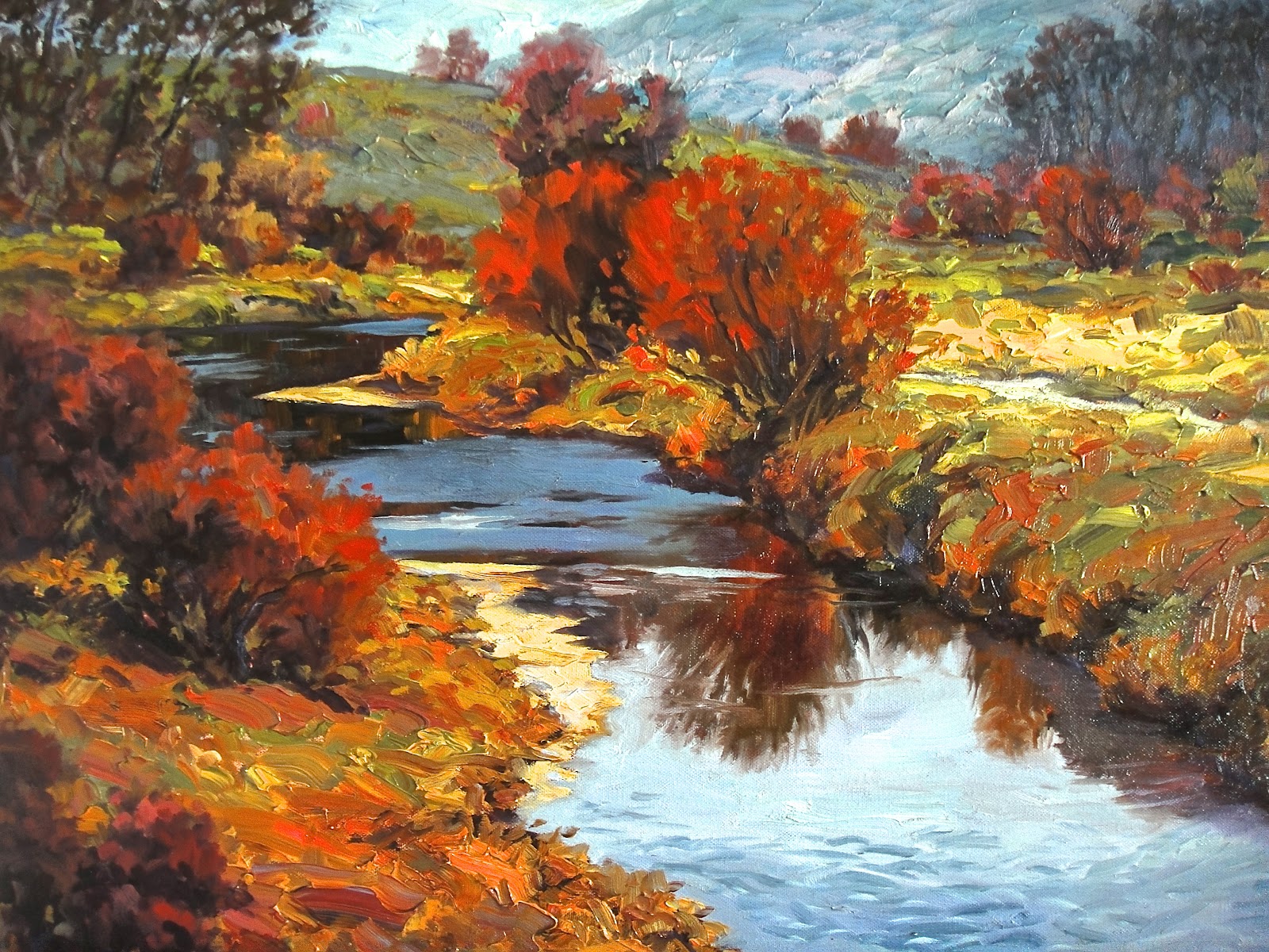
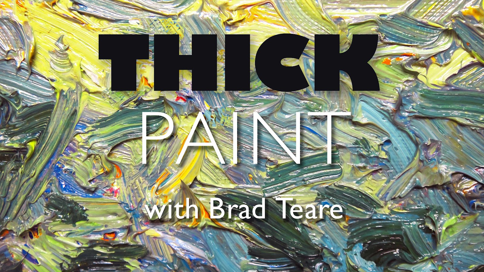
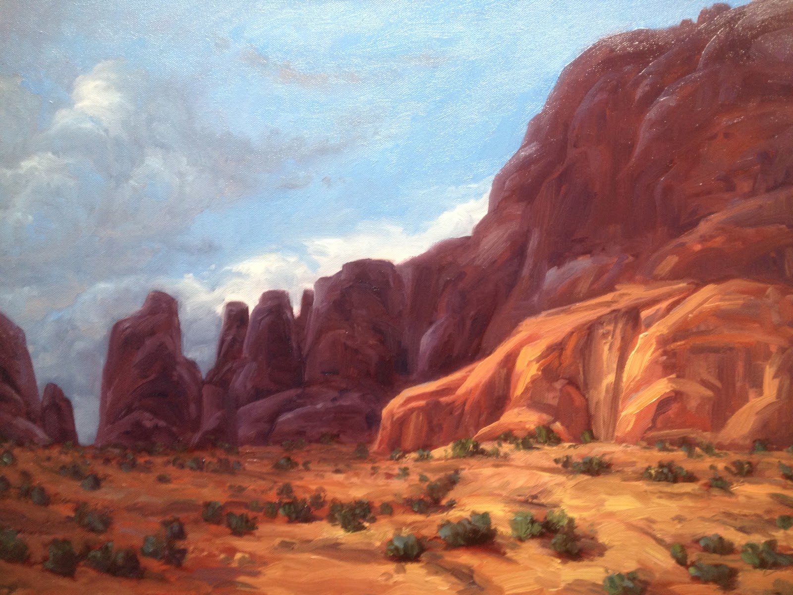
I changed several aspects of this blog based on information from the series. Rhoads explains that an artist is a brand. I named my blog Thick Paint because I initially started the blog from my fascination and frustration with painting thickly. But I now realize that my name is my brand. So I rebranded this site Brad Teare with a sub head of The art of Thick Paint. Rhoads reasons that an artist must have a promotional campaign just like BMW or McDonald’s. Accurate branding, or projecting a clear, authentic message, is at the heart of that process. Rhoads also suggests that blogs and web sites are essential to getting broader recognition but few readers read below the fold or below midway on a blog. So I reformatted my blog so more topics are above the midway point on the screen. If you feel this is an improvement (or a detriment) please leave a comment. Your opinions will help us all figure out how to make this work.

One of the most anticipated themes of the DVD was how to make advertising work. Rhoads again suggested the campaign model. Don’t place ads, he suggests, create an advertising campaign. But unfortunately he also advises if you don’t have the money to advertise with a campaign, don’t advertise. I don’t currently have the funds to advertise correctly so I’m locked out of that avenue to improve my career. He cautions against going into debt to advertise and I agree. Debt for artists can be a quagmire.

There are other fascinating ideas; how to get into a gallery, how to work effectively with gallery owners, how to leverage relationships in the business. Another change I intend to make that was not explicitly mentioned in the program is to start signing my work with my full name. Previously I’ve contented myself with Teare as my signature. If my name is my brand I need to broaden its recognizability by signing my full name so people can read it. It seems too good an opportunity to miss. Even though I’m fortunate to have a unique last name my full name allows me to be more easily located via the internet and other venues.

If you know how to jump the gap from no funds to advertise to implementing a successful ad campaign I hope you will offer your ideas below.

Brad Teare February 2013

PS- Another benefit of the DVD was I finally learned how to pronounce Camille Przewodek‘s name.

108: The Art of Sketching

IT’S BEEN A WHILE since I’ve made a video but I wanted to share some of the fun I’ve been having lately with sketching. Not only is sketching incredibly important to develop a great composition it is also a valuable way to evolve a distinctive compositional style. Your compositions should have the same signature look as your paint strokes.

I also wanted to share a great sketchbook my wife gave me that was created by book maker Teodora Poiata in Portugal. I love drawing on the highly textured pages which have been toned with a beautiful yellow ochre patina. Teodora’s Etsy site is here.

109 Selling Art

AS I THOUGHT ABOUT how to to get the funds to run an ad campaign as suggested by Eric Rhoads I immediately thought of my woodcuts. For a decade I was primarily known as a woodcut artist and had considerable success in that medium including a show at the Forbes Galleries in New York City in 2007. But sales have diminished in the fine art print field which I attribute to the demise of the giclée print which people now shun and unfortunately confuse with handmade woodcuts. My prints were the baby thrown out with the bathwater.


If I were to advertise in the best magazine for my style it would cost $3000 a month for six months. And I would need to generate that amount for several years. That’s a lot of money. But I refuse to concede defeat by a lack of advertising funds so I decided to investigate alternative possibilities. My first option was to repurpose the woodcuts as posters via TurningArt, a clever venture that promises to provide art to the masses and give a generous royalty to artists. I uploaded images for 16 woodcuts and 7 oil paintings. Since then my art has garnered over 1000 views with 316 people adding my art to their wish lists. More importantly I have 16 posters in homes that have generated sales of $236. It’s a far cry from $3000 a month but it might evolve to be a component of an advertising strategy.

The downside is TurningArt calls them prints continuing to muddy the waters surrounding woodcuts. But at this point I don’t think I can stem that tide so opt not to worry about it. They also radically trim the art to fit a 16″x20″ ratio which actually is fine since it preserves the unique quality of the originals. Also the signature is cut off in the majority of cases which contradicts my intent to have a legible signature on all my work.

TurningArt allows patrons to accumulate points toward buying original art. It would be nice if they were fostering a legion of art collectors but I have trouble imagining this happening. But I do salute TurningArt for attempting to broaden the market and lending moral support to artists. Their website is geared toward a mass market but maintains a degree of caché that I appreciate. The people who run TurningArt seem to genuinely love artists. I think they deserve to do well.

My second idea, based on the success of landscape painter Marc Hanson, was to set up an Etsy shop to sell my original woodcuts. This was a bit more difficult for me because many people have spent a great deal of effort fostering my printmaking career. I wondered if an Etsy site would diminish that effort. But again I felt I had little to lose especially if I maintained my prices. My prices are quite high but fair considering the amount of effort put into the prints (some of them are printed from 12 separate blocks). I couldn’t justify selling limited edition prints at fire sale prices just because I needed cash to advertise. While the Etsy environment is not quite right for prints of this calibre (forgive me for flattering myself) keeping my prices stable sends a clear message that I value these works of art and am willing to protect my collectors‘s investments.

I have yet to sell anything via Etsy and have only 130 views which on the internet is next to nothing. But the fact that my favorite sketchbook is sold on Etsy is a good sign since I would not hesitate to buy again from that shop. If I enjoying shopping on Etsy perhaps others will too. I definitely think Etsy could be classier and their search engine seems to be lacking. I searched for Brad Teare and couldn’t find my site using any permutations of my name or woodcuts. TurningArt charges nothing for its services although I think you have to be invited. Etsy charges $.20 to list an item and if the product doesn’t sell within four months it is automatically de-listed.

I have high hopes these projects will allow me to advertise soon. I will keep you informed as to how that effort is evolving.

Brad Teare March 2013

110 Who we are

In 1981 my friend Joe Hebert invited me to join him in an ascent of Devil’s Bedstead, a prominent peak in the Sawtooth Mountain range in Southern Idaho. The photo at right was taken by Joe at the summit, which was a vertigo inducing space with the footprint of a large automobile. Off the south side was a sheer drop at the bottom of which was an emerald lake nestled in a rock strewn valley. The beauty was as refreshing and austere as the mountain air. The only thing lacking was my plein air kit. And, more importantly, an ability to use it.


I discovered this photograph while going through some old reference files. What struck me about the photo was the look of total confidence in my eyes. At the time I was enrolled in illustration at Utah State University and working as a layout artist at an animation studio in Salt Lake City. I was making my way in the world. But I couldn’t paint. I could barely draw and I wonder now how the studio managed to keep me on for three seasons without firing me.

Yet I envy that look of total confidence and wonder where it went. I have to remind myself that it was the look of total confidence. It was the confidence of the naive. I admire it but realize that since then I have accumulated many strengths that more than compensate for that look. But seeing the photo did cause me to shake my head with sadness at much of life with its mundane obligations, uninspired fellow-travelers, and all that weighs us down and pointlessly consumes our lives.

But the things I’ve learned far outweigh the things I’ve lost. Otherwise I would have abandoned the artistic journey long ago. The photo reminds me that the exuberantly optimistic boy is still alive. He has taken a few blows and is worse for wear but he still lives. He has taken the guise of an aging man but continues to thrive despite the ongoing wear to his camouflage. That optimism, that exuberance so common to youth, is who we are . . . still.

Brad Teare March 2013

111 New book about paintings

I was thrilled when I recently published my book Persistence of Vision via Blurb, one of the world’s premier on-demand book publishers. It was one of the most satisfying projects I have recently worked on. I knew about Blurb almost seven years ago but their default formats didn’t seem quite right for my project which I felt needed a customized treatment. But recently Blurb came out with a plugin for InDesign that allows for complete customization. It was great to lend a personal feel to the book using custom fonts and layouts. As long as you keep text 1/4″ away from the borders you can do anything you want including full color bleeds. In my book I have several spreads that are full bleeds. It is pretty impressive and looks fantastic to have an art book with that level of detail.


I opted for the 8″ x 10″ size because I wanted to keep costs low and felt that using full bleeds would compensate for any loss of page size. When I was uploading the book I discovered you can make a digital version and imbed videos. I plan to make a digital version soon and will imbed several of the best of Thick Paint videos in the back of the book. In the printed version I used non-web standard fonts so it wasn’t a straight forward upload. If you want to simplify the uploading process for the digital version use standard fonts like Times and Verdana.

I’m giving a ten dollar discount for the book to the first 20 people to email me. I will send you a promotional code for ten dollars you can use when you check out. The offer expires on the 30th of March, 2013.

Many thanks! I hope you enjoy reading the book as much as I did making it.

Brad Teare March 2013


112 Full value, full color underpainting

I have talked about doing an underpainting in other posts. Some have written and asked why do a full value, full color underpainting when so many painters recommend doing only a monochromatic underpainting? My answer is if a monochromatic underpainting works for you go for it. It simply doesn’t work for me. I find it difficult and uninspiring to match values to a warm monochromatic layer of paint (using a gray underpainting doesn’t seem to help either).


Full value, full color underpainting from Brad Teare on Vimeo.

In the video my underpainting looks more finished than it actually is. The color is actually very thin and blotchy. I try not to impart any virtuosity to the surface of my underpaintings  It is simply a record of color and value. In fact it is best if the surface is imperfect because it gives me an incentive to cover it up. I do try to keep the underpainting thin so the ensuing layers of paint do not show the texture of the dried pigment beneath. If I do have any visible texture I scrape it off with my sharpened ceramics tool before I paint over the top.


I keep my oiling up medium quite thick. I add burnt plate oil #8, and Gamblin G-gel. Lately I’ve been adding a reddish purple pigment which increases the viscosity and imparts a subtle and harmonizing hue to the ensuing layers of paint.

Let me know if it works for you.

Brad Teare- March 2013
X