There is a concept circulating that suggests the main goal of the digital revolution is to reduce obstacles to creativity. This means eliminating barriers so all ideas can effortlessly find their audience.
For over a year now I have wanted to publish a Kindle book of essays exploring painting with thick paint. Recently Amazon offered a plugin for InDesign that claims to reduce friction between book creation and publication. Which, if true, means I can easily prepare a book with InDesign and will no longer have to format in Microsoft Word or HTML.
My first offering will be a collection of paintings with a brief paragraph explaining relevant information regarding it’s creation. This first project–which should be fairly simple–will be preliminary to a larger volume. I congratulate Amazon on its efforts to promote frictionless creativity. UPDATE: Check out the digital book via the button below.
In this video I use a selection of tints and tones provided by Gamblin Colors. Many artists use tints and tones as the basis for their painting and add limited primaries. This is generally referred to as tonalism.
For me tints are a way to subtly change the values of colors. I found it made subtle value shifts very quick especially when I wanted limited variations of shading such as in the clouds.
Let me know how the technique works for you. Brad Teare March 2014
The deadline for my ad for the Door County Plein Air Festival booklet is at hand. Once again I feel inadequate to describe why potential collectors should buy my paintings. I believe in my artistic project but how do I communicate that passion to collectors? Via the ad I have an opportunity to connect with potential collectors beyond simply showing paintings at the central venue during the festival. Everyone will get a booklet and a chance to see my ad. It’s an opportunity to tell my story to many people in a way I probably won’t be able to do on an individual basis. As you can see in the accompanying image I chickened out and let my painting do the talking—although in conjunction with the ad I plan to write a compelling blog entry I hope some will read via the QR code. In the entry I will elaborate my painting philosophy, mention a few prestigious venues where my art has been seen, and add a photo so festival goers will recognize me. But will the QR link make connections not made with the ad? The inability to effectively connect with buyers is a traditional struggle for artists. Many–including myself—wish for a world where we wouldn’t have to actively sell our work. But in yearning for a different world we miss a salient point—artists must provide compelling reasons to collect our work. Art is communication and the responsibility for clear communication sits squarely on our shoulders. Yet when it is time to write ad copy for my own ads I’m still at a loss to describe why potential collectors are enriched by buying my paintings. Many assume the sole reasons for purchasing paintings are the visual aspects of the painting itself. But we fail as artists when we can’t communicate why collectors should hang original art on the walls of their homes. Perhaps it’s time to collectively articulate the unspoken, intuitive reasons to collect art. Brad Teare April 2014
A few weeks ago the Thick Paint blog logged over a million visits. In the blog’s seven year history it has had visits from nearly every country on the planet. My brother Steve drafted a series of questions to commemorate the event.
STEVE TEARE: You just passed a big milestone with your Thick Paint blog. Tell us about it and what it means to you personally.
BRAD TEARE: One million is a lot of visits. I have trouble wrapping my head around those kinds of numbers. But more than anything it suggests that a lot of people found the information useful. That’s very satisfying to me. I’m most proud of the innovations I’ve been able to share with fellow painters. Hundreds of people have emailed to tell me of their appreciation. I still feel that impressionist landscape painting has a great future. It’s evolution will only stop when artists abandon its development.
ST: What are some of the entries that pull in the most viewers? Why do you think those are so popular?
BT: By far the most popular entry is Getting Greens Right. I’m not sure why it’s so popular except that it’s a recurring problem for most landscape painters.Gayle Faucette Wisbon has linked to my site occasionally via her association with FASO and that has consistently created spikes in viewership.James Gurney linked to my Concert Window events which made them very successful. Meena Das Narayan, editor of Gulf Connoisseur, linked to my site and created a lot of international attention.Some topics don’t get many views yet I think they are extremely important like the videos on composition. I made them because my compositions were getting cliched and I had to rethink the whole subject. But I suppose it’s a little like getting people to eat their broccoli.
ST: Quickly give us a brief history of your blog. When has it been easy or hard and was there a pattern to when those times occurred?
BT: As you may remember I launched the blog after you suggested several times that the future of internet presence depended on having a blog. I resisted the idea for quite a while. It seemed like a cliche at the time as I imagined the only blogs people would be interested in would be about internet culture. But I decided the idea of a blog was neither good nor bad–it was what I did with it. From the start I wanted to make a blog that would have been helpful to someone like myself when I was younger. I wanted to provide information to artists who had difficulty finding resources to push their artistic projectsforward. I think I’ve filled a very small niche in the creative ecosystem. I’m actually surprised it’s been as well received as it has. There were moments when I’ve been discouraged and slacked off. But I’ve always gotten a second wind and pushed forward. In the back of my mind I thought some of the topics would make a good book. That idea keeps me going when other motivations fail.
ST: For other artists considering a blog, what kinds of tips would you give them that you’ve learned on your journey thus far?
BT: Authenticity is a buzzword we hear a lot but it’s absolutely essential to creating a viable blog. Authenticity as a core value is here to stay simply because the internet has allowed for greater transparency. It’s much harder for corporations to manipulate the public simply by pouring money into an idea. I love the idea that authenticity is something huge corporations can’t manufacture. It gives smaller players a voice where before we would have been drowned out by their massive PR campaigns. Another thing is if you feel compelled to write a blog just do it. I believe in the concept of frictionless creation which means that occasionally creative ideas get published prematurely. But it is better to get the process started rather than procrastinate with a great idea.
ST: Where does your content inspiration come from?
BT: I try to read widely and consciously pick books outside my reading list. That is a major source of ideas. Ideas are like electron scattering. One idea hits you and several others are cast off as well. I carry an iPhone everywhere and when an idea hits I use the voice recognition feature to make notes in Evernote. I have a massive list of topics that range from the practical to the philosophical. I do a lot of musing in that list and not every topic will make it into print. But lately I’ve been writing down topics that relate to engaging with collectors and how to advance one’s art project economically. I’m focusing much less on the strictly technical which in some ways is fine since I’ve covered that area fairly well. Although coming up is a video on a new medium recipe I’ve found to be superior to earlier versions. I’m a tinkerer so I’m sure there will always be a technical component to the blog.
ST: What do you feel is the single biggest benefit to you from starting and maintaining your blog over the years?
BT: Without a doubt I have been the greatest benefactor. My work has really improved over the last five years and it has given me the impetus to really fine tune my technique. It gave me a focus I wouldn’t have had otherwise. I wouldn’t be the painter I am today without this blog and the participation of readers and viewers.
ST: If you were to start fresh, would you do anything different today?
BT: I would say to think carefully about which platform you use. If I could start over I would go with WordPress and Vimeo rather than Blogger and Youtube. Blogger and Youtube are both owned by Google and have proved indifferent to small-scale bloggers like me. I would always use my own music which I would make in Garageband. With the early videos I used a variety of copyright free music but people would nevertheless tag some videos with copyright violations. It just isn’t worth the hassle and most of the copyright free sound tracks aren’t that good any way–if only because they get overexposed. I would love to work with a musician seeking some exposure via the blog but no one has stepped forward.
ST: What are your plans for the future?
BT: Some videos–especially the ones about my abstracts–give the impression I paint them in fifteen minutes or so which is not the case. I’d like to create something that more nearly recreates the actual experience of painting. I imagine such videos would be of more interest to collectors but I won’t know until I try it and see what happens.I would also like to make more professional intros and outros, with a bit of very inconspicuous animation. I’d like to do some longer videos with very subtle ambient soundtracks. In general I’m becoming more interested in how to attract people who are not artists but who nevertheless really love the art process. This would mean the blog would become less technically oriented and more philosophical.
I was recently contacted by Gbox–a new video streaming provider. They wanted me to create unique video content for their new venture. They offered me a fantastic royalty arrangement and an opportunity to generate funds for the Thick Paint project. Everyone who registers with them will receive three dollars worth of credit. My video is being offered for $.99 and I hope you will avail yourselves of his chance to watch what I hope will be a rewarding video and at the same time help push the Thick Paint project forward. Note that when you hit the buy now button a dialog box appears at the right. Type in your email and name and you should have $3 added to you account even though it says you don’t have funds. Just hit the play button and it should play without you adding any funds. Many thanks for your support! Let me know what you think of this new service. PREFACE TO THE VIDEO The video is about painting from the imagination but also about getting things right. If you can see the painting in your minds eye you can paint it. But sometimes it is difficult to bring that internal vision into focus. This abstract painting was done as a type of color study–I think of it as a guide to keep my memory on track. Brad Teare April 2014
In the competition for attention it’s hard to know which platform is best. In my interview a few weeks ago I mentioned that if I were to start over I would prefer WordPress over Blogger and Vimeo instead of YouTube.
I prefer Twitter over Facebook because of the brevity of the medium which makes egotistical excesses less likely. I can also post quotes from books I’m reading on my Kindle directly to Twitter, which is a great way to take notes while sharing ideas with followers. I prefer Vimeo over YouTube because of the more professional design and the more creator friendly environment [Note: I have since decided Gbox is the better video alternative].
Blogger is an adequate blogging platform but is owned by Google — the same people who own YouTube — and they are not creator friendly. I also have problems with the Dynamic Views interface. You might have noticed that the subscribe button is occasionally absent. There are other glitches that make for a frustrating user experience [Note: I have since abandoned Dynamic Views].
Blogger is nicely designed visually. The mobile version works extremely well which is a huge plus. I’m currently blogging from the theater via the iPhone Blogger app (also available for iPad) as I wait for the film to begin. I’m speaking softly into my phone using voice recognition. No one can hear me–although I’m awaiting the invention of a lip reading app–and I can use time that otherwise would be lost. That efficiency is a good example of Steve Jobs‘ metaphor of the iPhone as a bicycle for the mind.
When Jobs was twelve he read an article in Scientific American magazine that posed the question which animals move most efficiently. The answer was the condor with its broad wingspan allowing nearly effortless movement. Humans were listed as one of the least efficient animals. The writer then compared a human on a bicycle. A human using a machine drastically changed the results making humans the most efficient. Jobs resolved to invent a bicycle for the mind–a device to leverage our natural mental abilities–which became the personal computer, the iPad, and the iPhone. With the addition of a few apps my iPhone is a video camera, audio recorder, notepad, sketchpad, book reader, internet browser, visual archive, and metaphorical Library of Alexandria.
The film is starting and I’ve got to go. Until later–
Maroger medium is a useful but toxic medium prized by painters working in a realist tradition. I have been using a reliable substitute that has no turpentine or lead. It has nearly all the same properties, although it does lack thixotropic qualities. But it has the advantage that it can be customized to be thicker or thinner depending on your use. In this video I demonstrate how to make an easily prepared and safe substitute for Maroger medium. If you click the buy now button in the video frame you will get $3 worth of free credit to spend on videos with no obligation. Just type in your name and email. One thing that wasn’t captured on the video is that painting into this thick but buttery medium is just plain fun!
I use this medium to oil up the canvas, using it like a thick couch. I hope you find this medium as useful as I do. Let me know what you think.
In this video I talk about the reasons to use mediums such as Maroger medium and how they work as a paint additive and on the canvas as a couch (French for coating). Traditionally academic painters would oil up the canvas–add a layer of medium over a dry layer–to have a thin layer to paint into as if they were painting wet-into-wet. I also talk about my Gbox video about making a Maroger medium substitute that is easy to make and fun to use. Watch the Gbox movie here.
[NOTE: Since I originally wrote this post Gbox has essentially gone defunct as a video content provider. Accordingly I have removed my links.] As many know I’ve collaborated with Gbox to distribute a few videos (see examples below). Gbox is a new venue where creators post content for a fee allowing them to expand the quality and scope of their work. Creators can charge what they wish. In the tradition of Thick Paint I plan to keep costs low. I made the Thick Paint blog as a resource for artists who were struggling to find art information communicated in a clear fashion. I don’t want to create obstacles to that objective. But I want to expand my project–specifically by making a series of videos about plein air painting via Gbox. One of the creators of Gbox, Dirk Lueth, gives excellent reasons for why Gbox is the next step in web evolution–while speaking highly of the Thick Paint project. I use the word revolution. I really do think their concept will change the way content is provided.
I’m offering many videos, two of which you can access below, and am pleased with the ease of upload and use. If you are a content provider I think you should take a look at Gbox. As mentioned they are in the beta phase and are tweaking as they go. In the days to come they will be providing a more informative user interface as well as a PayPal entry point among many other innovations.
I was enthused with my attempt to imitate Maroger medium and wanted to try Gamblin’s Neo Megilp–which is explicitly formulated as a Maroger medium substitute. Jacques Maroger formulated his medium from the original Old Master recipe which was called Megilp. The main problem with the original Megilp is that it contains lead–which I banished from my studio. Neo Megilp seemed a bit too watery out of the bottle so I let a generous batch sit on the palette overnight to thicken up (read more about Neo Megilp here). The main problem with my original painting was that the orange field was too flat and uninteresting. I wanted to add some thick oranges and yellows but didn’t want to lose the rich transition between the orange and blue. My initial application of medium seemed like it was just going to make the paint slide around on the canvas. But as I pushed the paint into the medium the Neo Megilp seemed to stiffen up. This might reflect some thixotropic effect. Although I still love my Maroger medium substitute Neo Megilp is equally low in toxicity and easy to use. Brad Teare–May 2014
Most artists are introverts. If you’re like me one of the things you dislike most is shooting a promotional photograph. Tonight I shot the photo at right using a device called the Selfy. It’s a remote trigger that syncs with your iPhone. All you have to do is sync it—there is no app or other download. Note that the trigger comes with a case. It appears to be a nice enough case but it is not essential to attach the case for the trigger to work. I use a battery pack so didn’t use the Selfy case. Frankly I was surprised the remote was so easy to use. I’m kind of a Neo-Luddite and the thought of difficult installations are painful. To get this shot I stacked a bunch of canvases against my taboret, turned the desklamp–with 60 watt incandescent bulb– toward my face and snapped about 20 pictures with the Selfy. I like this one the best because the lighting across my face seemed the most expressive. I rigged my StudioBoom with a device to grip my iPhone and turned the viewing mode so I could see the shot in the LCD display. I’ve never had fun taking promo shots until I used this set up. I think this is the first self promo shot where I’m smiling. Brad Teare—May 2014
One of the hardest aspects of landscape painting is painting in the field. To help that situation I’ve devised a series of videos–offered via Gbox–that will help painters move forward with their plein air painting. This course will be especially helpful if you feel stalled in your plein air progress. The first two videos–really one video divided into two 12 minute segments– highlight how to use a preliminary drawing as a stepping stone to a successful painting. Below is the intro to the series and beneath that are the two Gbox videos.I’m starting with the basics. I hope you enjoy them. I noticed the team at Gbox have added a PayPal option which works great. Be sure to ask questions in the comments section below. I ‘d love to taylor this series to your needs. Many thanks. One explanation I skipped in the first video was that I simply drew an outline of the scene and then shaded in the approximate values. It happens really fast and I didn’t demonstrate that in the video. The rest of the video is adding detail and adjusting values while thinking about the upcoming painting process.
There are many reasons to use a limited palette in the field. It promotes harmonious colors. It helps maintain a smoothpaint consistency—which helps to foster broken color. It keeps colors from getting too dark—a common problem in the field. And it helps simplify color choices. The downside is it takes time to premix colors. This can be remedied by premixing before you go into the field. You can either pre-mix secondary colors in a protected palette box or you can premix colors and bag them into cellophane bags sealed with rubber bands. Since you already spent time looking at the scene while you were doing your sketch (see blog 172) you should have a good idea which colors you will need. I recommend adding at least two premixed greens, two purples, and an orange.
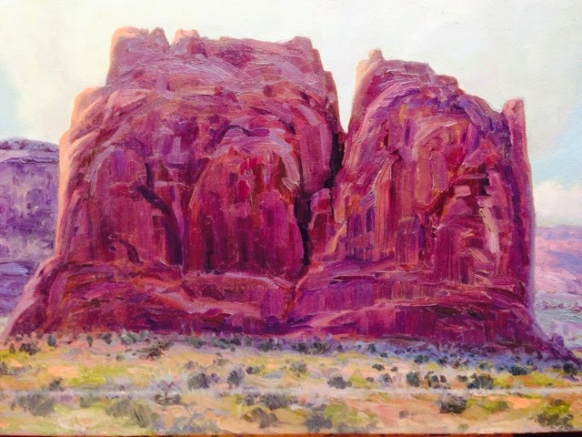
I chose three primary colors—Thalo blue, Quinacridone Red, and Hansa Yellow Light—because they’re high chroma colors and they tend toward the cool side of their color families—which makes for harmonious mixtures. In future Gbox videos I will be slowly expanding my palette to include an increasing array of pigments. The painting seen above, Wellsville Mountain, is 20″ x20″, and was painted in a two hours plein air session. The following Gbox video is $.49 and is 12 minutes long. It is the first in a series of three parts. Brad Teare— May 2014
The following article about the Trinchera Residency is from the Medicine Man Gallery site. I migrated it to this blog to insure preservation of the entry. It was a great experience and I look forward to the Trinchera reunion.
The Forbes Trinchera Residency
In August 2006 I was one of fifteen artists invited to a painting residency at Forbes Trinchera Ranch in southern Colorado. Forbes Trinchera is a 400 square mile ranch founded by Malcolm Forbes. We were invited by Kip Forbes to paint the valley and mountains he loves. In addition to paying all expenses Kip Forbes is providing a venue for our work at the Forbes Gallery in New York City. American Artist magazine, which co-sponsored the trip, will run an article on the show and the residency.
Collecting Visual Information
Our primary job at the ranch was to collect visual information–paintings, sketches, or photos–to create works of art for the show at Forbes Gallery in March. I was perhaps too optimistic and brought a van-load of huge canvases. Although there were moments of sunshine the week was dominated by quickly shifting weather conditions punctuated by downpours. Since I’m used to the nearly perpetual sun of Utah it wasn’t easy for me to adjust. I initially responded by succumbing to an artist’s version of writer’s block. I knew I had a limited time to collect usable reference so I adapted by switching from painting to sketching. It was the right strategy and I produced a handful of great sketches I can use to make woodcuts for the March show.
Getting in Gear After three days of sketching I adjusted to the weather conditions and was able to paint a few usable paintings. I had to remind myself that plein air painting is a means to an end and for me it is pointless to expect finished work in the field. I forced myself to embrace Robert Henri’s dictum that the principle aim of the artist is to achieve a state of mind where making good art becomes inevitable. Once I achieved that state of mind–or an approximation–I actually painted a few paintings worthy of frames.
Camaraderie One of the most enjoyable aspects of the residency was the opportunity to meet so many incredibly talented artists. Just to be included with them was a great confidence booster. My wife Deb and I look forward to the show in March as much to see our fellow artists again as to see the show. Cool Easel I bought a new easel especially for this trip. It is a reproduction of the Gloucester easel used by artists such as Edward Redfield and is made by Take-It-Easel. I bought it so I could add a huge palette and avoid the constant cleanup I experience with my French easel. Although I did do some large paintings (24” x 36”) the easel worked just as well with my smaller 9” x 12” studies. If you want the flexibility of working large or prefer a large palette area I can strongly recommend the Take-It-Easel. It’s easy to carry and set up and performed admirably in a variety of weather conditions. Brad Teare–June 2014
–From a distance, the paintings of Lynn Boggess appear to have a hard-edged reality. Close-up that reality dissolves into a flurry of abstract marks. Few painters embrace a synthesis of order and chaos with such virtuosity. His choice of color and depiction of texture imply a keen observation of natural effects. His work covers the gamut of times and seasons, and every painting seems to be a distinct record of a specific moment. Regardless of subject matter, Boggess creates an inimitable world in paint. (See more paintings here).
BRAD TEAREI first noticed your work ten years ago in an article for a show at The Principle Gallery. It seems like your highly individual style emerged on the scene fully developed. Did you find your style fairly early in your career or did you experiment with different techniques along the way?
LYNN BOGGESSMy style was decades in the making. I was introduced to landscape painting at an early age through my Junior High School art teacher who was an admirer of Andrew Wyeth. His quick study watercolors were a huge influence, and I filled the walls with my own watercolors based on charcoal and pencil sketches from direct observation. The success of these early paintings gave me enormous encouragement, so it was an easy decision to pursue an art major in college.
I was fortunate to have several instructors who liked to camp in the forest and do watercolors en plein air. One of them was an Abstract Expressionists, the other a Color Field painter–which was really a helpful addition to my Wyeth realism. Graduate School introduced me to Minimalist compositions and emphatic textures.
But these elements did not successfully merge until I was a Professor of Art in mid-career. When they did, it was something of a violent power surge to my imagination. Within a few years, I resigned a hard-won professorship to paint professionally, and there’s been no looking back–not a lot of time for that!
BRADOne aspect of your artistic project I really admire is your portable studio.You essentially create an outdoor studio in the wild. What inspired you to build your portable shelter?
LYNNI enjoy designing and constructing equipment as a break from painting, and that is very helpful in the Appalachian forests where I paint. Having a portable shelter allows me to concentrate on painting free from worry about the weather. The fact they are custom made allows me to pinpoint exactly what I need.
BRADHow long does it take to paint one of your large canvases?
LYNNThat is one of the most frequently asked questions, and for good reason. The larger the painting the longer it takes to paint, of course. But the question points to something more important–the energy in the paint. My most successful work is done as rapidly as I know how to work, with as much intensity as I can generate. When I get tired I stop painting–I don’t just slow down. The final look of the painting has an air of urgency that conceals the many hours of intuitive searching it required.
BRADYour color suggests you avoid photographic reference. Do you ever paint in the studio or is all of your work painted in the field?
LYNNPainting en plein air is so much more interesting and advantageous that once an artist is tuned into it, anything else is a cheated experience. My wife would probably tell you that I am obsessed with it, but since she is also an artist and respected art professor, she understands! Photographs? I strongly recommend NEVER using them. However, photographic images, such as on a projected screen, can be helpful at times. What’s the difference? To me, it’s a big difference. A screen has a glow that increases the sense of depth and vividness.
BRADThe color in your paintings cover the full emotional and seasonal spectrum. I was surprised to note that you use a fairly limited palette since the color in your work is certainly not limited. From photographs and videos I’ve seen it looks like you use a warm and a cool version of primary colors.
LYNNI use the ages-old Academy Palette of two reds, two yellows, two blues, and two whites. Painting on location demands making critical decisions about what is essential and this palette is as simple as one would dare. And it is astonishing at how many variations can be mixed with so few colors!
BRADYou obviously love texture. How did you discover such an amazing repertoire of textural marks?
LYNNTexture is such a profound part of our world. What keeps me fascinated with the process I use is the interplay of simulated and actual texture. When I happened upon using a cement trowel–and working to perfect a high degree of realism with it–that was when my career got under way. Brushes must work very hard to achieve what a hard edge can do in minutes. The range of possible textures allows the physicality of the world to be emphatic–something that is philosophically important to me.
BRADIn the combination of your portable studio, your use of trowels, and the scale of your work there is something refreshingly authentic and harmonious about your process. I’m assuming the trowels give you more flexibility somehow. How did you come to use cement trowels?
LYNNI had used trowels off and on throughout my training in the usual manner–in service of a convenient under painting. In the spring of 2000, I was on my roof repairing a leak with roofing cement and a small trowel. I found myself dabbing and scrapping and really enjoying the process. The next day I grabbed the trowel on the way out to do a small study of trees. Within minutes it was apparent that this was what I had been searching for. That summer I did one hundred small paintings, of which I kept twenty-five. Of those, I chose one as an application for representation at a local gallery. The director asked for four paintings to show on a trial basis. They sold very quickly, so eight more were requested, and those sold, and so on.
BRADHave you abandoned brushes?
LYNNI don’t use brushes but in rare instances. The trowels I use are shaped narrow to allow for easier cleaning–which is a constant part of the process. I usually begin with a large eight-inch blade, and gradually trade down to smaller as the painting progresses. The final phase is to use the small painting knives for the finer details.
BRADYour compositions have an intimate feel as if the viewer is ensconced in nature rather than being a distant viewer. You often focus on pattern and let overt linear composition recede into the background. Do you have any unique guiding compositional principles? How much of your compositional process is intuitive and how much is the result of an intellectual process? Do you follow any traditional compositional method?
LYNNLandscape paintings are philosophies encased in compositions. This really is a very complex, critical question. I avoid using the Golden Section and prefer focal points either in the middle or on the edges because they allow the space to be read simultaneously as a flat abstraction and as a recessional depth–something that helps me understand the paradoxes of life in general. That paradoxical experience is also emphasized in the illusion of space and the thick texture of the paint.
BRADIs sketching a part of your compositional process?
LYNNMy process is completely wet-in-wet, so no, I never sketch. Searching to find a form and space in wet paint is always an exhilarating way to work. Through countless hours of practice, one can enter a level where great risks yield great rewards. In painting that level is wet-in-wet.
BRADWith your concern for pattern and the scale of many of your paintings abstract elements seem a large part of your work. Is abstraction a conscious effort?
LYNNA scene before me is information, and my thoughts about it is imagination. Those two are negotiated throughout the session. But I try never to forget that I’m making an interpretation called a painting first, then a record of what is there. As a result, I take great liberties with the scene. And it really doesn’t take much of a scene to generate a painting. It would be a shock to some to see where some of my best paintings were done.
The most original and interesting compositions are intuitive. Working quickly allows access to the intuitive, and since it is of paramount importance, I begin there. It is only at the very end of the experience that I slow and resolve awkward areas.
BRADI love your work and appreciate you taking time from painting to share your ideas and methods with the readers of Thick Paint. Many thanks!
I have wanted to publish a digital book with Amazon for several months. New developments allowed me to make this happen quickly—Amazon now has a plugin for Adobe inDesign that allows easy conversion from inDesign files to Mobi files (the type necessary to publish on the Kindle).
As the title suggests the book is a collection of 53 paintings along with a handful of woodcuts accompanied by short paragraphs describing the work and in some cases the technique. Be sure to pinch the images to get close-up views of the thick texture. There is a short essay at the end of the book about painting with thick paint.
I made the book so I can view my work in the field. In a month I’ll be going to the Door County Plein Air Festival and I find it useful to be able to view a variety of paintings as a means to get into the flow. It’s a big confidence booster and I want to give Door County my best effort.
The book is made specifically for viewing on the Kindle reader for the iPhone. I always have my iPhone with me in the field and it should prove very convenient. But the book also works on the Kindle Fire, as well as the Kindle Reader for any Android phone, or PC or Mac computer. It really is a great way to view work away from the studio. If you have a Prime account you can borrow it for free. If you download it I hope you will consider giving it a review.
 There is a concept circulating that suggests the main goal of the digital revolution is to reduce obstacles to creativity. This means eliminating barriers so all ideas can effortlessly find their audience.