Many people wonder why painting in plein air is so difficult. I consider it the greatest painting challenge. Contrasting plein air painting to studio painting reveals the challenges of painting in the field.
In the studio we have plenty of time. We can easily adjust the paint so it will dry slowly. We work from a sketch, a plein air painting, or a photograph. All of which we can prepare and study at our leisure without worry about the passage of time. In the studio we can transfer the drawing one day, do a full-value color underpainting the next day, and on another day we can oil up the canvas and begin applying the final coat of color—in several painting sessions if need be.
A process that takes two or three days in the studio is compressed into two or three hours in the field. It is the compression of time that causes difficulty for plein air painters.
The best solution is to break the plein air process into steps. There is no reason not to do a sketch one day, an underpainting the next, adding the final coat of paint on the third day (provided the light is consistent). Once this more lengthy process is mastered the painter can begin compressing a few steps into one. For example a painter might do a preliminary sketch, a thumbnail, and transfer the drawing onto the canvas in one session. The following day the painter might paint an underpainting and on the third day add the final coat of paint.
Some might object that this unduly lengthens the process. But if all else fails this is the most reliable method to begin painting quality outdoor paintings.
It’s important to practise getting quality results. Floundering in the field painting one bad painting after another is not the best way to learn how to paint well. I’ve heard it said that one needs to get mileage on the brush. But it is best to practice painting well—no matter how long it takes—rather than practice painting badly.
Brad Teare — June 2014
View from the Capital, 11″ x 14″, plein air sketch
Here is an eight minute video about simplifying values in the field. In order to paint quickly you need to simplify. In the studio one might use four or five values zones–but painting in plein air you have to find a way to compress the process.
Squint to see the three value zones. At first it won’t be easy. By adjusting how tightly you squint your eyes you will be able to discern subtle value differences.
The easiest value to see is the dark. The next easiest value to see is the light. Things get complicated in the middle value range but be persistent and you should be able to see the middle value zone as one flat shape. It’s tempting to paint value shifts within this middle range. But force your values to be similar, making any value shifts very slight. Concentrate on keeping the middle value colors very saturated. Emphasizing color saturation will help you keep those values anchored in the middle zone.
In the accompanying video I have added light accents and dark accents into the building. If you see accents paint them in. But remember that they are accents and should not dominate or over power the basic middle value. Especially in white shapes you will notice a wide value range. But even with white objects try to keep the values as close to the middle value as you can. Don’t use pure white with highlights.
This concept —though somewhat difficult to internalize—is critical to painting successfully in the field. I hope you find it useful. Let me know how it works for you.
Many of my videos are now available via Gbox, a new content provider primed to compete with media juggernaut YouTube. In time they will be a great alternative to YouTube–but with more innovative ideas and options for creatives. They are currently in beta phase but are evolving rapidly. I’m impressed with their creative mindset and look forward to unveiling future innovations. Here are four of the latest imbedding options–my favorite is the last which has a large impact and allows for reviews. The second is the option for mobile phones:
I made a short video with Gbox about painting the foreground. It is often hard to get a really fresh and energized foreground. It’s necessary to use more abbreviated strokes and abstract shapes in the foreground because adding too much detail attracts too much attention away from the focal points. In this particular composition I wanted to lead the eye away from the center where I placed a round tree—not the best idea—but I wanted to see if I could make this work with a very active and high chroma foreground.
This Gbox video is available free. You can earn points by sharing and purchasing videos. These points can then be redeemed to watch other videos. I think it’s an intriguing idea and wanted to experiment to see how it worked. If you’ve purchased any of the Gbox videos you will have earned at least one point to watch this. Let me know how it works for you.
When people enter a well furnished room and see a fabulous painting they want to get closer. Such magnetism is a powerful emotional gift to the viewer. If they see an original—not a poster or mechanical reproduction—they witness firsthand the journey of the artist’s mind and hand embodied in a physical artifact. To be in the presence of such authenticity evokes an energy that transforms a glance into an experience.
YOU BELIEVE IN EXCELLENCE
Supporting an olympic team or orchestra denotes sympathy for excellence. Supporting artists who create world class art signifies a similar kinship. Surrounding yourself with inspiring friends deepens and enriches your life. In like fashion original art inspires and uplifts. Supporting excellence builds a vibrant culture that benefits all and becomes the superstructure for intelligent and meaningful society.
YOU BELIEVE IN BEAUTY
Much of the modern world is visually fatiguing–the tangle of telephone lines, billboards, and urban signage exhausts the viewer–much like exposure to constant noise. A selection of original paintings offsets the eye-lacerating effects of the modern world and provides a visual oasis to recharge and refresh the mind. The imagination constitutes a large part of our lives and original paintings are a potent way to keep the imagination alive and vibrant.
YOU BELIEVE IN MAKING A DIFFERENCE
You realize that although aspects of life can seem mundane the sense of being alive is fostered by acts of significance. By collecting original art you participate in the venerable tradition as a patron of the arts. Art fostered today becomes the cultural legacy of tomorrow. People who buy art make future paintings possible. People who collect art are people who expand their cultural contribution and make a real difference.
YOU BELIEVE IN CREATIVITY
You realize that those who excel embrace creativity—whether they are doctors, lawyers, housewives, or craftsmen. Creativity seeks to expand and magnify all human experience. It is the invisible value that rescues any effort from the mundane. You understand this process and intuitively surround yourself with people and objects that enhance your engagement with creativity. Paintings are tangible witness to your belief in creativity.
I recently did a remix of the popular Getting Greens Right (over 120,000 views). This version is available for free on the Gbox platform, a venue that not only has a great future, but will soon be a fusion of a blog and a YouTube style website. Let me know what you think of Gbox. To the right is a plein air painting I painted from Sister Bay during the Door County Plein Air Festival in Wisconsin. I painted all my paintings during the festival in the frame which were covered in plastic wrap. After the painting was completed and ready to hang I removed the plastic. The wire hangers were already in place. It worked well although I want to modify the idea for future festivals. Brad Teare–July 2014
I wanted to repost a video that has not been available for some time although it was very popular on YouTube. This time I posted it with Gbox. I used the larger embedding format which I thought was more visually accessible.
The video is free although I have allowed for donations up to a dollar if you feel the video helped you with your painting. But either way I hope you enjoy the video and let me know what you think of the ideas and the Gbox presentation. I really do appreciate your feedback.
At the bottom of the page I include a link to a fantastic book that expands on ideas about zones and many other topics critical to landscape painting. I think it is one of the best books on the subject.
I JUST got back from the Door County Plein Air Festival. It was a great experience. The painters in attendance were amazing and the resulting show was by far the best plein air show I’ve seen. The event was extraordinarily well planned by the staff of The Peninsula School of Art and it was a pleasure to meet fellow artists. My personal performance was good although the overwhelming greens of Door County threw my desert dwelling sensibilities a curve. But after the first painting–which took a record five hours to paint–I successfully adjusted my palette.
By Friday evening everyone had four paintings in the gallery. I felt my work was competent and adequately exhibited my thick style–with perhaps less broken color which I attribute to excessive focus on getting the greens right.
I didn’t sell as many paintings as I did in 2010 which was surprising. But such challenges gives us opportunity to review our motivations and methods. I’m not advocating taking counsel from our fears or giving up but setbacks can induce the type of introspection that incites meaningful change.
I embrace the feedback from Door County only to the degree that it confirms my own intuition. Two ways lie before me–retreat to a thinner style with more accurate representation or distance my style even further from conventional plein air technique.
Brad Teare, August 2014
Above: Door County Canopy, 16″ x 20″, oil on linen, painted en plein air July 22, 2014
I’ve been searching for a way to simplify and streamline painting in the field. My oil painting gear has expanded to the point I feel I’m on safari for even the most impromptu forays. And I’ve lost much of my original impetus for painting en plein air–which was to record the effects of nature rather than create gallery worthy paintings in the field.
In such a frame of mind I encountered James Gurney’s newest video Watercolor in the Wild (available from his website on DVD, $US 32, or by digital download, $US 14.99). In addition to being one of America’s foremost oil painters James Gurney has a rare gift for defining artistic problems and articulating solutions. In this latest offering I found what I was subconsciously yearning for–a means to recover the fun and immediacy of plein air painting while fusing my love of drawing and painting.
In this 73 minute video Gurney shows how to simplify plein air gear to the bare essentials. He uses a combination of pan water colors, special mechanical watercolor brushes you load with water or inks (I didn’t know such brushes existed), along with graphite and water-soluble colored pencils. It’s an ingenious fusion of techniques that allow the seasoned painter, as well as the neophyte, to come to grips with the often maddening complexity of plein air painting.
The ideas in the video promise a return to the roots of why I started painting in the field–to absorb the beauty of nature, record its fleeting effects, and use the sketch to enhance my studio paintings. If you’re looking for a way to revitalize your plein air efforts or need a bridge between your drawing skills and your ability to paint out-of-doors you might want to try this method with me. I will share my efforts in future blog entries.
Fellow thick paint enthusiast and painter José from Spain recently wrote me and asked how to use the grayscale in the field. I thought it was a great question and made the following video to help explain the process.
We shall not cease from exploration, and the end of all our exploring will be to arrive where we started and know the place for the first time.–T. S. Eliot
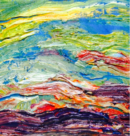
I started my recent exploration of abstraction by painting in oils. My hyper-thick applications of oil paint soon proved cost prohibitive and I switched to acrylic–of which I had an ample supply in my studio. I was an early adopter of Golden Acrylics and had dozens of large jars of the Heavy Bodied Paint as well as large bottles of Liquid Acrylics (I painted with acrylics in the early days of my illustration career). I bolstered this supply with a variety of discounted jars I discovered at a local art shop buying nearly the entire inventory (it can be risky buying on-sale acrylics as some jars can be semi-dried. But my purchase was excellent). While I was painting up a storm with acrylics my abstract oils were slowly drying in the corner. But I soon noticed that the thick passages were beginning to wrinkle–showing signs of alligatoring. Some people call checking alligatoring but that, I feel, is a misnomer. Alligatoring is the wrinkling of oil paint that is applied in an excessively thick layer–which is very different from checking–and caused by an entirely different phenomenon. Needless to say I was shocked by this development and grateful I switched to acrylics for my upcoming show. Acrylics can be applied thickly but will dry much thinner due to the evaporation of water that gives bulk to the strokes. Additives can be mixed with acrylics but I have yet to achieve the juicy, robust stroke of a brushhighly loaded with oil paint. But I’m working on bridging the gap. I have a wide variety of pastes, gels, and additives to give the acrylics various textures. In the painting above I used a profusion of Clear Tar Gel. It’s an extremely glossy, odd feeling medium with a slight thixotropic quality that may give me the effects I’m looking for. Time and experimentation will tell. Brad Teare–August 2014
In previous videos I often used a Sharpie marker to draw my underpainting on canvas. Since it is a waterproof marker I assumed it would be safe to use with acrylics and oils. I eventually noticed that the Sharpie was bleeding through the underpainting of both my oils as well as my acrylics.
I am not sure of the chemistry that causes this to happen but is easily avoidable by switching over to an acrylic marker. In this video I demonstrate using a Montana brand marker. I was really impressed with how well the marker covered the canvas. I used it to paint the edges of the gallery wrap black and it worked perfectly.
The acrylic goes on smooth and thick. I could quite easily fill in the white gaps in the canvas.
From now on I will use an acrylic marker for all of my drawings on canvas. Let me know how it works for you.
One night I had a dream. And the dream changed me. Like most artists I have drawn since I was young. My earliest dream was to be an artist although I had no idea what being an artist entailed. One of my earliest memories is helping my dad make a fence. For some reason I asked him what prejudice meant. He explained the word in the context of civil rights. While hammering nails my father told me of defying Jim Crow laws while he was a soldier stationed in the South after World War ll. Like many Americans I was raised to respect all people regardless of race or creed. Despite my upbringing I never identified with the civil rights movement. I thought it was an issue for States to work out on an individual basis. I could envision no role for me to play. One night several decades ago I dreamed I was an African American. In the dream no one would listen to me. I went from place to place trying to express myself in complete futility. The reason people ignored me was the color of my skin. Previous to this dream I made no effort as an illustrator to include other races in my illustrations. This was not overt racism on my part but rather a lack of empathy caused by profound cluelessness. After the dream I felt a focused obligation to include other races in my illustrations. I didn’t become a political activist–that’s not my nature. But after the dream I never allowed any racist comment or insinuation to go unchallenged in my presence. Art is imagination made tangible. Art is a compelling force if imagined with enough vitality and clarity. In the communication revolution those who communicate best prevail. Artists live in the world of dreams. That is not a position of weakness. It is not a position of powerlessness. Our job as artists is to imagine a more beautiful, more interesting, and better world. That dream has the power to change us–and to change the world. Brad Teare–September 2014
I HAVE written before about the Canadian painters known as the Group of Seven. They all used an element of abstraction in their work but one, A. J. Casson, pushed the boundaries the furthest (his painting is seen below). Rockwell Kent had a similar approach to both drawing as well as painting. A fantastical quality is not foreign to many landscape painters–such as Albrecht Bierstadt and Thomas Moran. But Casson employed a more modern compositional sensibility. I’m fusing such compositional methods with my acrylic abstracts in an ongoing exploration of texture in paint. Brad Teare–September 2014
(UPDATE: click here to see the latest video of Roberts’ recent work.)
I first became acquainted with the encaustic paintings of Dale Roberts at the Marshall Gallery in Scottsdale, Arizona. His work has a textural, luminous quality using layers of rich, vibrating color. His paintings are characterized by a contemporary quality rather than subject matter and the light in his painting varies from mid-day veils of fog to the glow of twilight. Due to the translucent nature of encaustic his work is nearly impossible to photograph (the best way to perceive the luminosity is via video which gives a more comprehensive glimpse of the refracted light). By fusing a distinctive compositional sensibility with a novel painting style Roberts has created a uniquely beautiful body of work. BRAD TEARE In my experience encaustic is a very demanding medium. Did you embrace encaustic because of the innate beauty of the luminous pigment or were there other aspects–either technical or aesthetic–that drew you to the medium? DALE ROBERTS The intrinsic beauty of the paint was and is very attractive. I was drawn to the vast range of application possibilities, everything from smooth and flowing to thick and encrusted. The quality of light passing through translucent layers and unlimited open working time were both aspects particularly suited to my temperament. BRAD The freshness and spontaneity of your work suggests you are an excellent draughtsman but having never seen your sketches until recently I was surprised at the accuracy of your sketches since the corresponding paintings are more loosely rendered. How do you decide how to abbreviate form as you work from your sketches to the final painting? DALE After analyzing forms and compositional elements through careful studies and preparatory drawings I discover the salient qualities that serve the aim of each encaustic that follows. Deeply understanding my subject allows for freedom when honing in on what is important visually. Successful painting is often the product of intelligent and even visceral editing. BRAD Your urban scenes, especially the paintings of bridges–which nearly constitutes a sub-genre of your work–have an abstract quality to them. Most artists concede that abstraction is the basis of composition yet not all artists express such a contemporary sensibility. Did you study abstraction? Have you ever painted purely abstract images? DALE During my years at art school, Rochester institute of technology and Tyler School of Art, I availed myself of a full range of study. I dove headlong into a deep immersion of figurative painting and the importance of craft as well as exposure and practice of the most contemporary abstraction. Both streams find their way into my present work. BRAD Is your compositional method a conscious one or purely intuitive? What formed your compositional methods? Were there specific theories or teachers that helped form those ideas? DALE Composition for me involves a kind of flirting with the boundaries- boundaries of forms, panel edges, divisions and compositional conventions. I will often make multiple preparatory sketches using a variety of mediums–editing, reworking, and sometimes reassembling them to arrive at the most effective result. The process is a combination of intuition and study. The main impulse is to keep the process–including work on the final panel–as fluid as possible allowing for changes from minor to cataclysmic whenever necessary. I’ve studied dynamic symmetry, episode and cinematic strategies, as well as compositional solutions throughout the history of art. Roger Anliker and Charles Schmidt both from Tyler advocated a wide range of compositional solutions with the salient principals being internalized for an intuitive response. BRAD How do you discover your motifs? Is sketching always a part of that process? DALE Since compulsive sketching, plein air Watercolor, Gouache and Pastel studies are my practice the motifs I paint are an outcome of that discipline. I also do a lot of mental composing when I’m not in the presence of the subject as well. BRAD Did the technical skills necessary to paint in encaustic come intuitively or did you struggle to become proficient? I’ve heard artists say they could never do woodcuts because their mind doesn’t work that way–removing the negative space to reveal the positive. Are there certain gifts or traits that facilitate working in encaustic?
DALE When I started working in Encaustic some 35 years ago, the training I had available was a brief discussion in the Ralph Mayer technical manual, my own stubborn ingenuity, and years of more or less successful attempts. It seemed that through that experience my own sensibilities began to fuse with the revealed character of the encaustic process. It’s come to the point where I think in those terms as I address a potential theme and subject. Early on the skills required were rather utilitarian, while later they assumed much more sophistication and specificity. I’m still in the practice of adding new approaches sometimes out of the pure joy of discovery. Encaustic does lend itself to a physical approach, and as the son of a carpenter, the building process of the medium was sympathetic to my aptitudes. BRAD From your videos I see you work from black and white sketches. Do you ever do a color study or do you rely on memory to paint color? Do you have a guiding theory of color that allows you get such beautiful color harmony in your work? DALE I do color studies from the subject in gouache, watercolor or pastel. Often I will paint several variations experimenting with the color intensity, value range and potential layers I might use. This practice has resulted in a trove of small versions of many of my larger encaustic compositions. In spite of all that planning, the painting ultimately has it’s own internal color character as it develops allowing the color studies and other notes to serve as a scaffold to launch from. BRAD Encaustics seem like a medium typically practiced in the studio. I was surprised you paint in the field on occasion. Is plein air painting an integral part of your process? How does your plein air process contrast with your studio methods? DALE Whenever the opportunity presents itself, the right combination of subject, electrical availability (for heating paints) and a sensible stretch of time, the prospect of plein air encaustic is wonderful. Working outside from life tends to elicit a decisive approach as I deal with the transient nature of light, weather or other unforeseen constraints. BRAD Is texture a conscious concern or do you let texture build as the layers require? Do you ever add anything to your paint, like chalk, to build up texture? DALE I suppose I can characterize my use of texture as a responsive one, both to the subject and to the paint film as it develops. I will use inert elements such as string, acid free paper, and occasionally marble dust to build texture and interest. My tools are a combination of studio and shop items which help me achieve the ends I have in mind. BRAD One of the surprising aspects of encaustic is that the paint can be reworked at any stage. How does this effect your process? Do you tend to work on one painting at a time or do you rotate each painting through multiple stages? How long does it take to paint one of your larger paintings? DALE Whenever I teach about a medium I will often begin with its application and then how to remove it. Understanding the medium/solvent aspect of any medium is crucial to working with a level of expertise and even abandon. The thermoplastic nature of encaustic is particularly freeing to me in that context. I am in the practice of working on as many as 11 paintings during a given studio season and even reworking something years later. My larger paintings, up to 6’ x 4’ might take a couple of years to come to fruition. BRAD I understand it is important to have good ventilation while painting with encaustics. Can you share what ventilation system you use or what might be adequate for the beginning encaustic painter? DALE I use two Honeywell HEPA units as well as fans and open windows. I’m careful not to burn the paint using a cooking thermometer to monitor the temperature at 205 degrees. Also there is no turpentine in my mixture, which I make by hand using beeswax and dry pigments. BRAD After watching one of your videos I bought a set of encaustics and found I really enjoyed the medium. One thing I was unsure about was the idea of fusing the layers, that is, applying heat to fuse the new layer into the lower layer. It seems that such a method blurs all of the hard won detail that might be in that layer. Any tips on how to fuse without losing detail? DALE I suppose working from general to specific has its merits when faced with a necessary step that can obliterate details accomplished in early stages. I’ve made and lost countless such moments on the way to figuring this process out. A tip for fusing without losing detail would be to heat it ONLY until the area begins to exhibit a shine, and then move the heat source away. BRAD If an artist wants to paint urban scenes it’s necessary to paint chain link fences effectively. But painting chain link drives me crazy. Any hints how to paint such detail in encaustic? DALE One method is to paint the area behind the fence, and then score the lines for the fence into the film. Fill the void with the colors you want and then scrape away the excess using a razor blade. You might also invert that method, painting the fence first and then painting the background over it…scrape the film down to reveal the fence embedded in the image. BRAD You are an amazingly prolific artist especially since you worked a demanding day job for many years. How were you able to advance your painting career and hold down a 9-to-5 job? Are there any words of advice you might give artists pursuing a similar path? DALE In the inspirational words of a former professor The first MILLION are practice, and If you have 20 minutes you can do something wonderful. I will also add that to balance such a life an artist needs to understand that it’s about doing the good hard work, with discipline and consistency over time. Painting is all about the long haul, certainly not an easy road. BRAD I love your work and appreciate you taking time from painting to share your ideas and methods with the readers of Thick Paint. Many thanks! Brad Teare–September, 2014
Here is a short Gbox video about how I add layers of acrylic paint to create the painting shown here, Abstract Evolution, 48″ x 36″. It is not a step-by-step analysis but rather just a series of stills showing the layers as they were painted. Most of my acrylics are not painted alla prima but rather in discrete layers. I used Golden Colors‘ acrylic Clear Tar Gel as a medium into which I applied textured layers (as if I were oiling up the canvas). I also scraped into the wet layers using a variety of knives and sculpting tools. Toward the end I added Golden’s Clear Granular Gel. It is notable because while it adds a heavy texture it dries completely clear. Brad Teare–October 2014


