HEREare parts 3 and 4 in which I finish the 36′ x 36′ acrylic, Waiting for Spring. This painting session (comprising both parts 3 and 4) took about 45 minutes. My first step was to cover the entire canvas with a mixture of 15% Utrecht Retarder Gel and 85% Golden Clear Tar Gel. I used the mixture to lubricate the canvas like oiling up with oil medium on a dried oil surface. The medium has a milky consistency common to acrylic mediums but dries totally clear (clear tar gel dries with a resin-like surface that I really love). One of the goals of this session was to reach back into my artistic history and connect with methods and techniques over which I had acquired mastery. I found this specific process to be extremely intriguing as it allowed me to incorporate elements from drawing and printmaking. I look forward to your comments. Brad Teare –March 2016
I HAVE bad news–everything you’ve learned about how to become a successful painter is wrong. Here’s the traditional trajectory of success: work hard, get a great gallery, make money, be happy.
But according to the book The Happiness Equation by Neil Pasricha this equation needs to be reversed.Being happy, he writes, opens up our learning centers. Our brains work at maximum capacity only when we are happy. He advises, be happy first. American philosopher William James agrees when he said, the greatest discovery of any generation is that a human being can alter his life by altering his attitude.
I’ve always been a pensive person. Elementary school teachers wrote things such as thinks too much on my report cards. I always flattered myself and felt this melancholy frame of mind fit well with the artistic temperament. When I left home at 18 I asked my mother if she saw any aspects of my personality that would cause problems. Yes, she answered, rather too quickly, you have a moody streak.
The Harvard Business Review reports that happy people are 31% more productive, have 37% higher salaries, and are three times more creative than their bummed out counterparts. Shawn Achor in the book The Happiness Advantage writes, it’s not necessarily reality that shapes us but the lens through which our brain views the world that shapes our reality.
Aristotle wrote, happiness depends upon ourselves. Victor Frankel said, everything can be taken from a man but one thing: the last of the human freedoms — to choose one’s attitude in any given set of circumstances, to choose one’s own way. Walt Whitman penned, keep your face always toward the sunshine— And shadows will fall behind you.
All of these quotes suggest that we have the freedom to choose our attitude. The reason we easily fall into negativity is that being on the lookout for the worst possible situation is part of what keeps us alive. It’s an innate aspect of the survival instinct. It’s part of being human.
These ideas, as well as a profound intuition, made me realize I needed to be happy first. The most important aspect of my decision to change was the realization that my attitude not only affected my painting, it spilled over and affected those I love most—my wife and daughter. The way forward was clear—if my pensiveness was affecting my career and family I needed to change.
Strangely, changing for others comes easier to me than making a change to benefit only myself. I believe focusing motivation away from ourselves will allow us to perform the mental jujitsu necessary to effect permanent change.
How you will affect change to become happier and more creative will depend on your personality and personal values. But once we know and understand the necessity of happiness in our personal success the necessity of change becomes inevitable.
ART culture has problems. One of them is the rise of celebrity culture eclipsing 99% of art being created. For some reason the modern art world only respects winners–which in their dysfunctional value system means artists who generate boatloads of cash. Very few people can occupy that slot. It is a convention that works better in sports and politics. But with art, and the diversity of artistic tastes, such monopoly means nothing at all. Who lacks such insight they will declare the world’s celebrity artists the only artists worth talking about? Read any cutting edge art magazine and you will note that the cognoscenti spend more time talking about art celebrities than actually looking at art. How did this system get so distorted? Instagram recently announced it was changing it’s algorithm to promote the most popular posts. I have enjoyed Instagram for its ability to reach a broad audience. I recently connected via Instagram with an arts magazine that asked me to write an article for them and with a museum curator who wanted a show of my woodcuts. But the new change will not promote such random connectivity. It will be yet another example of the winner-take-all mentality so frustratingly pervasive today. What exactly does the new algorithm mean? It means that some of your favorite artists will be buried by the avalanche of mediocrity that pervades social media. It also means that images such as a notice for my upcoming woodcut show would get buried in my feed before the show, yet rise in the feed as it randomly garners likes after the show is over. Heaven help the artist who posts a picture of her cat. Such strange logic ultimately benefitsonly those artists garnering the most likes (which in my feed are not necessarily my favorite artists). Those of us trying to make a living in art will get buried by those making a killing. I shake my head in frustration at the shortsightedness of social media CEOs and view their unchallengeable domination as the rise of corporate tyrants. The answer for independent minded artists may be to abandon social media. For more in depth insight into this phenomena I recommend the book The Winner Take All Society. Let me know your take on the subject. Brad Teare –March 2016
Persistence of Vision, by Debra Teare, oil on canvas
Study hard what interests you the most in the most undisciplined, irreverent and original manner possible.–Richard Feynman, Physicist A RECURRING theme of this blog is developing and maintaining creativity. It is one of art’s most intriguing subjects and one of the most mysterious. I read a blog post recently about creativity in web design but found it relevant to my current painting project. Read the article here.
The main idea for me was that it’s better to keep moving forward rather than getting bogged down in the minutiae of a perfect surface or a virtuoso performance. There is much to be admired in the work of Bouguereau, David, or similar artists. My wife, Debra Teare, paints hyper-realist trompe l’oeil paintings and I find her work fascinating. The point is to know what end you are pursuing. If that type of virtuoso performance is what you are trying to achieve it is best to know at an early date.
My current objectives are less concerned with surface or virtuosity and more about a visceral, spontaneous expression. All types of art have their place (as well as art forms and techniques not yet created). Meanwhile I found the aforementioned article excellent food for thought. Give it a read and let me know what you think.
COLLECTORS need to understand why you create your art. Additionally if no one understands how you create your art it is unlikely collectors will connect with your artistic project. I’m having a woodcut exhibit featuring all of my color woodcuts from the last twenty years at Alpine Art on April 15, 2016. Lost Key woodcuts are nearly a lost art. With the idea of expanding the understanding of this little known art form I wrote the following explanation:
The Technique of Color Woodcut Printing
Multi-color woodcuts using the Lost Key method are uncommon because they are extremely difficult to do. They require a lot of planning and patience. It is a very different creative experience than drawing or painting. To make ten woodcuts of one of my portfolios, for example, I carved eighty-three wood blocks. I then inked each block with different colors and printed each color of the series by hand for a total of 2490 impressions (not including artist’s proofs which are experimental impressions taken to evaluate color and registration which include an additional 250 passes through the press).
For each impression I mixed the exact color of ink (which often takes hours), applied the ink to the block with a roller, registered the paper to the block, and hand cranked the block through an antique Challenge proof press. With the woodcut “Long Valley Morning” I passed each woodcut through the press twelve times which means that the thirty sheets of that edition passed through the press 360 times.
But before I can print I have to carve the blocks. I start by drawing a linear drawing, usually from a plein air sketch or painting, directly onto a block of wood. If the scene has a cloudy sky, for example, I make the transferred drawing define every outline of every cloud. I then carve away the wood that has no lines on it. I ink the carved block with black ink and print it onto a piece of vellum (which won’t absorb the ink). I then place a new, uncut block into my press, register the vellum and run it through the press. This presses the wet ink outline from the vellum onto each block in a process known as counter-printing.
In the clouds I may want to fill each shape with a light blue. Using an uncut block with the dried counter-printed image as a guide I carve away everything except where I want the light blue to appear. I then go back to the original black block and carve away the outline of the clouds. This technique is called “lost key” printing because the original linear woodcut, or key, is carved away. Some of the key block is usually retained as the deepest notes of the print (but rarely exposing total dark and few if any linear details). The linear aspects of the first block are obscured by subsequent layers. This laborious process was used by woodcut artists such as Gustave Baumann. It creates a less linear and more painterly looking woodcut without the black outline of more common techniques. It takes a lot of fine tuning between the various blocks to get them to harmonize together and every additional block makes it exponentially more difficult. When the ink is dry I hand emboss and hand deckle each print.
I prefer to call the art created by this method “woodcuts” rather that “prints” because the process has nothing to do with modern photographic or computer printing. Each woodcut is handmade and unique. I carefully deliberate over each color of every impression. I carefully adjust each impression to give maximum aesthetic value. Slight variations are made into strengths by adjusting the following impressions which give the woodcut texture and vibrancy. Only the very best are selected for the final editions. These are then hand signed, named, and numbered, usually in a limited edition of 20 to 40. I resurface my blocks to cancel the editions.
I hope this description will foster greater appreciation for the art of the woodcut.
(NOTE: The class sold out on April27 but the University is scheduling another session. If you add your name to the waiting list you will be added to the upcoming class.) WEBERState University invited me to give a painting workshop. I will teach how to paint a landscape using four fundamental steps. It will be held on Friday, June 24, from 4pm to 8pm at the Kimball Visual Arts Center, Room 307, on the campus of Weber State University in Ogden, Utah. The cost is $60 but the University will provide all essential supplies, including paints, brushes, and canvases (easels will not be provided but you are free to bring your own). Desks are available and should prove adequate for this session. Register here. I won’t be focusing on painting thickly in this class and the workshop will be applicable to all levels of ability, even if you have never painted before. If you have been waiting to jump start your painting skills this is a good opportunity. If you know someone who would benefit from this workshop I hope you will forward the link. See you there! Brad Teare –April 2016
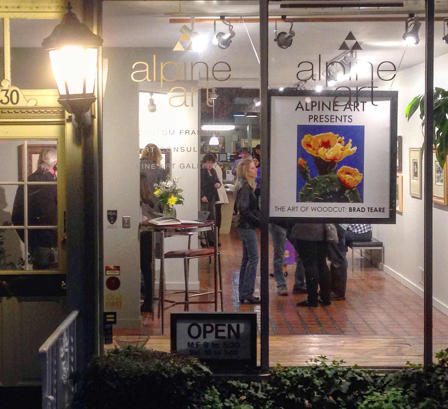
I AM enthused for my woodcut show opening 15 April 2016 at Alpine Art from7-9. It is a thirty year retrospective of my woodcut career and there will be more than twenty color woodcuts on display. On Thursday from 7-8:30 I will give a talk about the art of woodcut. We are giving away two of my woodcuts, Totem, and Fish Totem, so be sure to get a free ticket at the door. For those unable to attend the artist talk I made the following video outlining my basic technique of printing. Although I usually print on my antique Challenge proof press, the principles are the same. Hope to see you at the show. Brad Teare –April 2016
FROM time to time controversy emerges about the archival reliability of acrylics. I’m a longtime user of Golden Artist Paint’sHeavy Body Acrylics and love the smooth yet thick texture. I’ve recently added their High Flow Acrylics to my painting arsenal. I’m also a longtime reader of Golden Colors’ publication Just Paint and have enjoyed their compelling research into the archival nature of acrylic paint. I contacted Mark Golden, president and co-founder of Golden Artist Colors, and asked if he would be willing to talk about the archival aspects of acrylic paint. He very generously agreed.
BRAD TEARE The acrylic paintings I’ve created over the last decades show no signs of fading or cracking. Is there any reason to believe the current robustness of the paint film will fail at some point in the future?
MARK GOLDEN Because of the need to communicate as clearly as possible let me start with the most accurate answer: there is no reason to believe that quality artist acrylic paints will fail in the near future or even the far future–as distant as 500 to 1000 years.
This is not to say that acrylics don’t have their own problems but acrylics are not going to suffer damage like other plastics such as nitrocellulose, PVC, or styrene. Nor will artist acrylics suffer to the same extent as artist oils–which have problems with embrittlement and yellowing.
We only have a 70 year history with artist acrylics so our timeline is relatively short. Yet when we compare artist acrylic paintings to similarly aged artist oils we can confidently say that acrylic films are holding up well and compare favorably to more established media.
BRAD I’ve read that acrylic paintings by Andy Warhol, David Hockney, and Mark Rothko are beginning to fail. Is there a reason for this? Should this be a cause for concern for those of us using acrylics?
MARK This is exactly where recent authors of various blogs and articles have both conflated issues and misled painters. One clear example was an article showing a conservator working on a Warhol painting with the text suggesting it was in disrepair. The photo actually illustrated a cleaning project and, in fact, the piece is in wonderful shape.
While it’s true that conservators and conservation scientists are working to develop the best ways to clean acrylics it is not the case that these paintings are failing. Most of Rothko’s work that failed were from the misuse of oil paint. Hockney started using acrylic in the 60’s and 70’s and it was an important media shift for the work he was doing at the time. Those acrylic paintings have been holding up very well.
BRAD I’ve had oil paintings crack from being struck as well as cracking when taken off the stretchers. I’ve had no similar problems with my acrylic paintings. Are there cases when an acrylic will crack?
MARK Acrylics create a wonderfully flexible film but there are unique situations that can cause acrylics to crack. Quite a bit of research has been conducted into the changes acrylics undergo in low temperatures. As we get to 52˚F and below acrylics get stiffer. Below freezing acrylics are as brittle as oil paintings and can crack if shocked, dropped, poked, or unrolled.
Finally, there can be a type of cracking called crazing during drying. If a film forms on the surface of a thick acrylic and the painting is moved before it has a chance to fully dry it is possible to tear the surface which then creates a craze in the film. Also if one adds too much water to the acrylic and works thickly with the product it is possible to create crazes in the film. And finally if one uses thin mediums and tries to pool them up into thicker films as the water evaporates it can create too much stress on the upper level of the film creating river valley-like crazes.
BRAD To my understanding the archival quality of paint has three factors–the lightfastness of the pigment, the visual stability of the medium, that is, whether the medium will cloud or acquire unwanted color over time, and structural stability–whether the medium will crack, flake, or suffer other structural problems. Do these concerns accurately describe potential archival problems?
MARK The main concern is this: will a medium fail and destroy the artists’ intent to the point the work is no longer meaningful except as a historical artifact? Such failure includes fading, darkening, or changing of pigments exposed to various conditions, light being the most damaging.
Other failures include the visual stability of the medium, clouding, yellowing, opacifying, or various exudates from the binder or additives (that is, the appearance of sticky, gooey, or crystalline substances). And finally structural stability of the paint medium and its components. Structural stability is a bit more complex and confusion often exists as to the current best practices regarding how to conserve acrylic paintings.
BRAD Anyone visiting a museum can see how some old oil paintings have cracked. Paintingconservators observed these failures and formulated best practices to help avoid such problems. Since acrylic paints are such a new technology how do scientists test the paint to predict how acrylics will age over time? Are these tests reliable?
MARK That is a wonderful question to ask the conservation community as they survey work in their museums–How many oil paintings on canvas in your collection have cracked? You might find a great majority have. But typically the cracks will have been made less noticeable by multiple conservation treatments. We don’t impugn the reputation of such oil paintings because they’ve cracked. It is understood that this is a normal result of many of the conditions that oil paintings have faced over time.
But your question is really: how reliable is the testing since acrylic have only been around for only 70 years? The answer is there are several compelling studies. In an 1976 article by the USDA Forest Service they conclude that acrylic waterborne dispersions are more stable in outdoor conditions than oils or alkyds (read article here).
The USDA has other reports but the outdoor environment study is the most interesting as outdoor environments are the harshest. The more layman friendly article (read here) reports the same basic conclusions from the first article: Acrylic latex resins are flexible and very durable. A good acrylic latex outdoor house paint will generally outlast a good oil-based house paint, and again … acrylic polymers are more resistant to sunlight than oil-based paints and therefore do not weather as quickly.
There are also accelerated aging studies of exposure of acrylic dispersion polymer to artificial ultra violet light. In a study by Prof. Paul M. Whitmore and Dr. Val G. Colaluca, The Natural and Accelerated Aging of an Acrylic Artists’ Medium (Studies in Conservation 40(1): 51-64 January 1995) they review the mechanism of failure with UV exposure. Clearly, the ethyl acrylate polymer undergoes chain scission under UVB exposure. This leads to a breakdown of tensile strength, chalking, and severe failure of the film. They also shared exposure results that would be equivalent to acrylic painting behind window glass, or indoor exposures. Their conclusion was the resistance of this polymer material to photo-chemical degradation by near-ultraviolet light is very high. In its photochemical stability and retention of mechanical properties, it can be a considered a ‘Feller Class A’ polymer material, and this probably derives both from the intrinsic stability of the acrylic polymer and from its high original molecular weight. After two hundred days of UV-A exposure this would have been a dose of near ultraviolet light–the equivalent of about 5000 museum years. Five thousand years! We’re talking about accelerated aging studies, which are not the same as 5000 years of real exposure, but even if we reduce this prediction five fold we still have a material of exceptional quality.
BRAD Do additives such as retarding medium affect the paint film? Are there other conventional acrylic additives that will cause the paint to crack or discolor over time? Do spray acrylic varnishes discolor? Should artists avoid acrylic sprays?
MARK There are many additives in acrylic paint. Painters who are curious about these additives should read the online version of Modern Paints Uncovered from the symposium held at The Tate in 2006 in London. We have a longer response as well in our JustPaint.org archives, The Acrylic Patina.
As for spray varnishes, we have evaluated quite a range on the market. Beyond our Archival Aerosol Varnish and our MSA Varnish, which have continued to perform quite well, Lascaux’s UV Varnish Gloss, Optima Millennium, and Schmincke’s Glanzfilm are also performing at acceptable levels.
BRAD One reason I shifted from oil to acrylic with my abstracts was because the oil paints in thick applications were drying with a weird alligatoring texture. It could take months for the effect to show but there was nothing I could do to stop it. So I switched to acrylics and greatly enjoy the expanded textural possibilities. Are there any archival dangers from applying too many layers of paint or too much texture in acrylics?
MARK We haven’t found any problems with multiple applications or textures with acrylics. I think this is where acrylics perform the best. The only difficulty can be that artists are experimenting with thicker and thicker clear applications. These thick applications will not remain perfectly clear or colorless over time.
Another problem with very thick applications is not giving the acrylic paint enough time to fully dry. As skin forms over the acrylic paint it’s more difficult for all the volatiles to release. As you paint thicker it simply takes longer for this process to resolve. Because of the wonderful flexibility of acrylics the newly painted film continues to remain extremely soft. Artists who move their thick paintings (½ inch or more) after just a few weeks of drying may see cracking as layers underneath haven’t had time to coalesce and form strong enough bonds.
This softness becomes an issue when shipping or storing and is exacerbated by thicker applications simply because it’s more difficult to pack and keep the thickly painted surface from contacting other surfaces or packing materials. Another problem with the soft surface is that it can be more easily marred than the harder oil paint film–another reason to keep the painted surface separate from other surfaces while storing or shipping.
BRAD I occasionally add sand, chalk, or pieces of paper to paint applications to add texture. Are there any archival problems these additives might cause?
MARK Over the years many artists have shared their acrylic experimentations with us. Acrylics are incredibly versatile and can withstand a range of additives. One needs to be cautious about adding too many solids as the best acrylics are only up to about 50% acrylic solids and can’t withstand the level of pigment or additives that oil paint can stand. For us in formulating acrylics it’s important not to exceed the Critical Pigment Volume Concentration (CPVC). Which means not adding so many solids that important properties of the acrylic binder are lost. If you’re at all concerned about excessive solids add some additional acrylic binder into your mixture. Test your experimental mixture on a Polyethylene sheet or wax paper and allow it to dry. Then take a look at the flexibility of the resulting paint mixture. Always mix these materials well into your paint. Otherwise you’ll end up with pockets of unmixed solids that will create cracking in the resulting mixture.
Many artists have added materials such as food, plants, or other organic matter. The acrylic will not encapsulate these materials in a non-porous wrapping and these materials will spoil.
BRAD I’ve read that Zinc White in oils should be avoided as it cracks in pure applications as well as in mixed paint films. This is observable in the skies and light areas in many paintings of the French Impressionists. Is Zinc White a safe color to use in acrylics?
MARK This is a question at the edge of our understanding of pigment binder interaction–especially in oil paint. Zinc is an amazing pigment for its ability to shift tints while maintaining a color balance that is not possible with the powerful tinting strength of Titanium Dioxide. The problem with Zinc in oils is the level of embrittlement of the resulting film.
In acrylic the film is so flexible that this is not currently an issue. It’s possible there are other critical interactions that we’re not yet aware of but so far the Zinc White in acrylic has held up quite well.
BRAD I occasionally sand the surface of my abstracts using wet-and-dry sandpaper blocks or an electric sander. Are there any archival issues with the heat generated by sanding?
MARK The best way to sand acrylics is to use a wet sanding technique. This keeps the dust down and, more importantly, is a much quicker way to sand the acrylic film. A recently painted acrylic (less than 4-6 months old) is still very sensitive to water. If you wet the acrylic surface at this point it dramatically swells the acrylic polymer making it incredibly easy to sand the surface to a perfect finish. Sanding the acrylic without water, especially with an electric sander, creates excessive heat.
BRAD I love Golden Colors’ innovative mediums such as Fiber Paste and my current favorite, Clear Tar Gel. Are there any new products on the horizon you can share with the readers of Thick Paint?
MARK I do have favorites and my current favorite is a product we’ve only released on a limited basis, Thick Gesso. I love troweling this material on and sanding it to a porcelain finish. We released our Coarse Molding Paste a year ago and this allows a level of texture between our Coarse Pumice and our Fine Pumice. Another favorite custom product is a paint line that never caught on, called Paste Paint. You can only use it with a heavy duty palette knife or trowel. Imagine the thickest smooth peanut butter–probably a throwback to my childhood!
BRAD I love the Coarse Molding Paste, too, and I will definitely be looking for the Thick Gesso. I definitely want to give Paste Paint a try sometime. They both sound intriguing.
Your insights are much appreciated, Mark. Many thanks for taking the time to answer these questions.
– I WAS invited to an online group about thick paint from a fellow painter from Austria. Later I discovered he was also the creator of a line of artist oil paints specially formulated for painting thickly.
The inventor, Walter Haas, told me he was inspired by this blog to create his paint and offered to send me a set. It was always my most profound hope that the blog would be a catalyst for such endeavors and I was extremely honored. In the accompanying video, I paint a cloudscape with Lilly Paints. I found the paint has a unique quality especially suited to painting with impasto and the experience, due to its textural qualities, was nearly effortless. (Read interview with Walter Haas here). In an email, Walter related that he experimented with a wide variety of mixtures to ensure a smooth yet thick paint. The paint really is unique–combining both fluidity and the ability to paint over preceding layers without effort. My compliments to Lilly for making such a fantastic line of paint (to see their line of pigments click here).
Abstract as it appears at Alpine Art in Salt Lake City
–I WAS talking with a fellow artist who was getting ready for a watercolor exhibit. As we all do before a show, he was agonizing over prices. He related a conversation with a prominent museum director who advised artists to make it a priority to sell their work–even if it meant lowering prices. I reacted negatively to such a suggestion. A few days later one of my galleries called and asked if I would be willing to lower my price on an abstract painting. They offered to take a lower commission, lowering it from 40% to 30%, to offset my loss. After quick deliberation, I agreed. But the transaction made me reflect on the strategy of simply selling paintings as a primary aim. The aforementioned museum director cited getting a large body of work on public display as an advantage of selling at all costs. Such exposure would be a cumulative PR campaign pushing the artist’s work. Certainly, no one could condone an artist selling art below the actual cost of creating the work. And with some artworks, this is too easy to do. Take a woodcut for example: if I frame a $950 woodcut with a $350 frame for a total of $1300, my gallery would sell it with a 50% commission. I would get $650 minus the $350 frame for a profit of $300. That’s a hard way to make a living especially since those costs don’t include shipping. Any discount from the original price would essentially make the sale a losing proposition. My current strategy with my woodcut show is to price the framed woodcuts high to encourage the sale of unframed woodcuts. My abstracts are painted on wide gallery wrap stretchers eliminating the need for framing. Although collectors usually add a floater frame industry standards for abstracts do not require display with a frame. After contemplating the above examples, the obstacles to just selling our work seems to be framing and shipping. The cost of the frame is often the factor that makes any discount prohibitive. There are many alternatives– cheap frames for one. But I hate tacky frames, and they are ultimately a waste of money since I usually reframe them several times or recycle frames no one wants (which is a huge hassle). My solution to shipping is to work with local galleries (which works in my case since I’m close to a large city, Salt Lake City, and a tourist destination, Park City).
I appreciate my gallery’s willingness to adjust their model to make a sale–including lowering their percentage. I’ve had galleries give discounts on art without my permission that essentially gave away the art and only paid for the frame. I’ve also had galleries insist I set prices without regard to their market saying they want artists to have the confidence to price their own work. What?! The gallery wants artists to be savvy business people AND paint masterpieces? What exactly is the role of the gallery? Simply hanging paintings and waiting for buyers no longer works. A gallery should be a partner and business consultant carefully guiding their artists to successful careers. If artists were adept at business, we wouldn’t need galleries. My criteria for working with a gallery are: Honesty (this is self-explanatory but essential), Professional (no discounts without consultation, paying on time), and fun to work with (making promotion, openings, and shows a satisfying and creative process). Thankfully my current galleries are exactly that–and working with them is a pleasure. I wish you the same experience.
–MY Wattpad book, The Art of Thick Paint, is being featured this month as an example of a book with embedded images and video. I will be migrating the book to Amazon in two months so if you want to read it for free now is a good time to check it out (scroll down after clicking on the book cover to read with black text on white paper): Also my book on Blurb is 25% off via the Blurb site (click on the full screen icon to get a better view of each page):
Use the code MYBOOKSALE25. This 25% off offer is good until May 6, 2016. I’m also offering the landscape book via Amazon within a few days but I suggest if you want the book you use the 25% off code as it is a much a better deal. I also have the book 53 Paintings and Several Woodcuts on Amazon for free if you have Kindle Unlimited ($2.99 if you don’t).
I really appreciate your interest in my work and your continued support of this blog. With many thanks,
I MET Walter Haas online in a group about painting with thick paint. During our conversation I learned Walter was a paint maker and he asked if I would like to try his specially formulated paint. I agreed and he sent me a set of Lilly Artists Colors. I painted a small landscape (watch video here) and found the paint delightful–it was easy to pick up off the palette and lay down on the canvas–yet retained the texture I love so much in a landscape painting. I asked Walter if he would agree to an interview about his paint and its development. He very graciously agreed.
BRAD TEARE– I really enjoyed using your paint although it was difficult to describe the exact properties in the video. As I used it I found myself totally focusing on the creative aspects of painting as technical concerns faded away. I attribute that to the unique nature of your paint. What prompted you to begin making oil paints using such a unique formula?
WALTER HAAS– It was definitely you who inspired me. After reading some of your posts, such as 69: The uses of putty and 106: Best chalk for painting I started to reproduce your mixtures to see how it would change the paints I used. Mainly, because I felt pretty much the same way as you, that I couldn’t get the consistency in paints I was looking for. They were either somehow too stiff or too thin.
BRAD– I’m truly honored this blog helped in any way to facilitate such great paint, Walter. It makes it all worthwhile. Since you have an intense desire to make an ideal paint I assume you have a background in art. Are you primarily a landscape painter?
WALTER– I painted my first oil painting 35 years ago. But I never became a professional painter. Only during the latest years I intensified my painting approach and took online classes to increase my knowledge. I started with surreal paintings, which I still love to do. But the challenge to become a good landscape painter increased over the years–so I put my focus on landscapes during the last 5 years.
BRAD– I imagine it was a difficult process to arrive at your final paint formula. Can you elaborate on how you formulated your paint? How many versions of the formula did you try before you settled on the final mixture?
WALTER– It was really difficult. The problem I ran into was I decided to work on too many pigments in the first place. As it turned out every single pigment required a unique recipe. But I couldn’t resist. So the recipes I made were in the thousands. I even developed my own software so I could keep track of the recipes. The ingredients themselves are actually no secret–the same ingredients other paint manufacturers use. I didn’t want to experiment with materials that had not been in use over the years. The recipes contain Fumed Silica, Castor Wax, and Aluminum Stearate. These ingredients are used in various combinations and mixtures by staying in line with the recommended maximum amount for each ingredient. The challenge is to get to the right mixture for each pigment. Sometimes I feel that pigments very often behave a little like teenagers when growing up. You have to have a lot of patience with them.
BRAD– I like that metaphor. In addition to having an amazing texture your Titanium White is very white. I’m assuming you’re using a clearer oil like Safflower oil?
WALTER– Yes, exactly. I tested dozens of oils. The most extraordinary was the so called Dragon’s blood oil from Moldavia. Supposedly it should dry very fast while remaining clear (something we would love to have in oil paints) but tests did not provide the results I hoped for. So I tested refined oils, cold pressed oils directly from farmers, walnut oil, poppy seed oil and so on. I washed the oils, salted and froze them, kept them in the sun for months, and tested them for yellowing, drying rates and viscosity. After 3 years of intensive testing I decided to use refined safflower oil for whites and blues, and for the rest of the pigments I use refined linseed oil.Nothing radical, but a proven way of using oils.
BRAD– I noticed that the paint can go on quite thin yet still retain the mark of the brushstroke. Is that a quality you consciously tried to achieve?
WALTER– Yes, that is exactly what I was looking for–a paint that can be used directly from the tube without modification, while at the same time having the consistency to retain its brush strokes and the characteristics you described so well in your prior article. To stay within this very fine line between too thick and too thin, you have to constantly monitor the manufacturing process. Paint usually stays thick for quite a while and then suddenly becomes liquid very fast. To control this process I had to create my own test procedure. So it is not only the ingredients that make the paint but also the manufacturing process.
BRAD– Many artists are rightfully concerned about longevity and the archival qualities of the paint they use. How do your paints compare in color permanence, and other factors, such as potential cracking or discoloring?
1. Use only the best raw materials. Pigments, for instance, are artist quality according to ATSMStandards (American Society for Testing and Materials) which is the highest rating.
2. Do not use ingredients that have no proven record of usage in oil paints.
3. Keep ingredients within the recommended minimum amounts.
4. Keep your recipe as simple as possible. The more ingredients a paint contains the more unstable and hard to control it will be.
WALTER– For the Artist oilpaints I do not mix any pigments together–not even for greens.
It’s my personal belief that artist grade paints should not come pre-mixed or otherwise altered. There is also no filler in these paints. It is 100% artist grade pigments. With the exception of phtalo green and blue, which would have too much staining power. Some earth pigments such as venetian red, golden ochre, burnt umber or terra die sienna are made from the original natural pigments, which makes them a little more transparent and less staining. Whereas Studio oilpaints simulates these natural pigments based on specific mixtures to become more opaque and intensive. Most Studio oilpaints are made of mixed pigments, in order to provide various greens, to simulate expensive single pigment paints such as cadmiums and cobalts and, as mentioned, to change the characteristic of some natural earth pigments. Studio Oilpaints also contain a filler, but only to the amount where you just barely notice a difference to the artist grade paint. So the quality is still very high. Regarding consistency both paints are the same.
BRAD– Have you tested how your paint performs in extremely thick applications, such as several centimeters thick?
WALTER– I tested the paint in one to two centimeter thick applications, but no further. At the moment I do not have information about the behavior of such thick layers.
BRAD– All of the paint tube labels were printed in English except one–what color is Irgazin Rot?
WALTER– Irgazin Red is a medium temperature red. Sorry, I must have mistakenly sent you a tube in the wrong language. I have never sent paints to the US before so these were my first English labels.
BRAD– No problem, Walter, it’s a beautiful red and, like all your colors, has a beautiful consistency. It’s a great honor to be an early adopter of Lilly Paints and share the results with the readers of Thick Paint. As soon as I finish my acrylic abstracts for my upcoming show I will be making a huge order! Thank you for your ingenuity and your generosity.
–INmy continuing quest to secure quality promotional material I assembled a new collection of abstracts using Blurb, the online, on-demand publisher. I’ve used them before and found their magazine option the most useful (their books are prohibitively expensive for leave-behind material). I created the magazine using InDesign and exported it as a PDF–by far the most convenient method if you use InDesign. Preview the entire magazine by clicking the cover below (or this link). Note that I moved the title on this edition so the preview bar on the Blurb site would not obscure the title. An interesting option with Blurb is the ability to simultaneously post a PDF version. Check out the downloadable option here. As soon as the magazines are delivered I intend to travel the short distance from my studio to Park City and connect with a quality abstract gallery. After I select a gallery my hope is the magazine will be a useful sales tool to persuade the gallery director to sell my work. Of all possible approaches I feel most comfortable with this more personable one. I will let you know how it goes. Brad Teare –May 2016
On view starting June 28, Dream of Blue, 36″ x36″, acrylic
–IF you are in Northern Utah from June 28 to August 3, 2016 be sure to drop by the Marmalade Library in Salt Lake City and visit the gallery on the second floor. The show features 10 large abstracts painted expressly for this show. There is a reception June 30, at 8pm. I would love to see you there. I also fine tuned my artist statement and the staff gave the tweaked prose poem top billing. I’m slowly boiling it down to its essence–a similar process I’m adopting with my abstracts. Also if you haven’t’ had a chance to see the woodcut show it will be open until June 10, 2016 at Alpine Art. Brad Teare –May 2016
–IN this short video I discuss how and why I paint abstracts. Concurrently I also experiment with a new filming setup I may use in future abstract painting tutorials. Let me know what you think of the process as I attempt to revise my methods. This series features a new splash screen and theme song (which I did in Garageband). Hope you enjoy it and thanks for your feedback. Brad Teare –June 2016
–FOR those attending my workshop at Weber State University this Friday, June 24, 2016 I thought it would be beneficial to review some basic principles we will be using during the class. Don’t worry if you don’t understand all the following ideas. We will review everything covered below in greater detail. The two images shown will be used in class to transfer the motif to a tinted canvas. You are welcome to bring your own reference but please make sure it is proportional to a 12” x 18” canvas and that you have a gray version that is divided into thirds with a color version the same size and proportions.
I will be providing grayscales for everyone to use. To review the basic theory of the grayscale watch
this video:
It would also be beneficial to review zone theory which can be reviewed here:
Mixing greens is always a challenge. Learn the best practices here:
Additional color information can be gleaned here:
We will be blocking color in with palette knives (which will be provided) so you might want to review this video:
Paints, canvases and all necessary supplies will be provided. I’m looking forward to the workshop. See you soon.