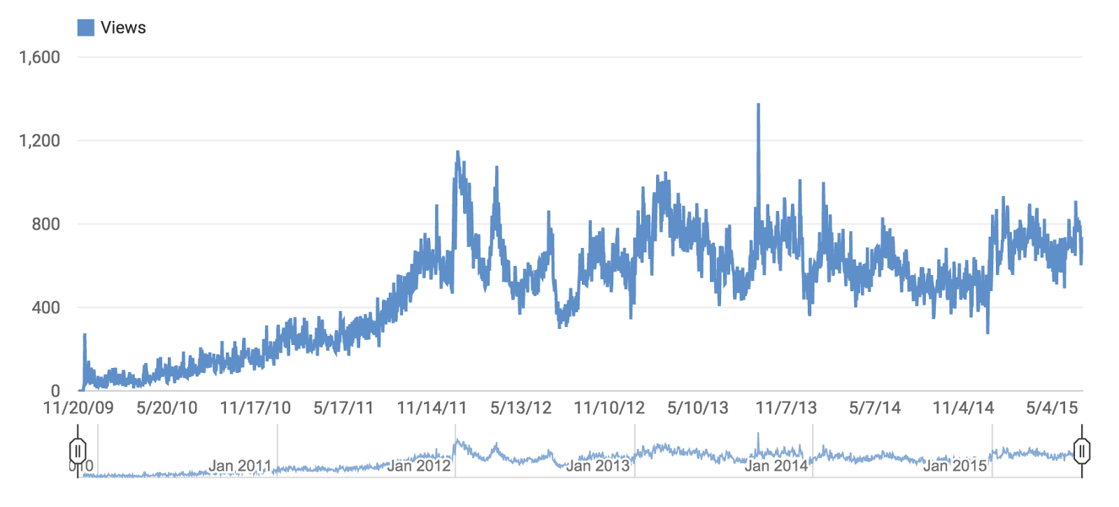
On the evening of 7 July 2015 the Thick Paint YouTube Channel clocked over a million views since the first video posted on 20 November 2009.
What does 1,000,000 views mean for the Thick Paint channel?
One million is just a number–but it’s a huge one! I guess it means there are lots of people interested in art and looking for information on how to paint–and that video is a preferred venue for learning.
Is there any evidence that interest is slacking off?
Not as far as I can tell. If you look at the chart the last year has enjoyed a fairly dense clustering of views. That section doesn’t have excessive highs or lows but views are consistent and averaging slightly higher. I view that as a sign of greater access for artists around the world.
How did you get the idea for the Thick Paint YouTube Channel?
I was on a painting trip to Sonora, Mexico to paint the missions of Father Kino and attended an exhibit of local art in the village of Magdalena. I detected in the very enthusiastic artistic expressions a similar yearning I felt growing up in Kansas–the wish for better access to art information. The desire to provide more information to a wider audience provided the inspiration for both the blog and the YouTube channel.
Have you been successful in providing the information your viewers need?
My only feedback is the numerous emails I’ve received expressing thanks for the channel. I’ve received letters from nearly every country on the planet that has internet access. It has been very gratifying.
You say nearly. Which countries haven’t you heard from?
I haven’t heard from North Korea or Cuba. There are a handful of countries in the interior of Africa that don’t appear to have internet access. I’ve never gotten an email from Iceland which logs in with 604 views. Iceland has the highest ratio of artists per capita of any country so I had expected to hear from an Icelandic painter (especially since Icelandic is one of the 53 translatable languages. Plus giving a woodcut workshop there is on my creative bucket list). With so many artists I suspect there is already enough art info in Iceland which is awesome.
How about from Central Asian countries like Kazakhstan?
Artists of Kazakhstan have visited the channel 758 times, which I think is pretty amazing especially considering the videos are all in English.
After visiting your YouTube channel do people go to your blog and translate the additional material into their native languages?
Unfortunately the conversion rate from YouTube Channel to blog is not very good. It hovers around a ratio of 2:1. I provide free videos on my Gbox channel as well but the conversion rates are even lower.
Any reason why so few people jump over to the blog?
I think it’s just so easy to access YouTube videos and go from video to video. I suspect most people don’t think they will get much additional info from the blog which is unfortunate. With translation the blog has a greater potential to reach a larger audience (see translation drop-down menu in the upper right corner of this blog). There is also a search function that is very useful (right under the translate drop-box). Artists can use it to find all the articles about sketching for example but few avail themselves of that feature.
What are you most proud of?
Numbers do count and I think it’s amazing that so many people have enjoyed the videos and possibly become better artists. That is tremendously satisfying. I never had any other intention for the channel and blog except to help other painters. Both have exceeded my expectations. The channel has over 4,400 subscribers which I think is pretty amazing too.
Any tips for those thinking about starting a similar channel?
Be patient. It took two years to get over 400 hits a day. In the beginning growth was slow. But if your content remains consistent viewers will show up. If you think you have something to offer jump in and give it a try. I’m an introvert and it was hard to be in front of a camera at first. But I’ve grown both from trying to communicate better on camera as well as gaining greater personal insight from articulating half-formed ideas. Many fellow painters have sent me great tips and painting suggestions. It has been really amazing. I discovered that if you want to grow–and you try to grow–you will grow. That’s one of the few things I can guarantee.
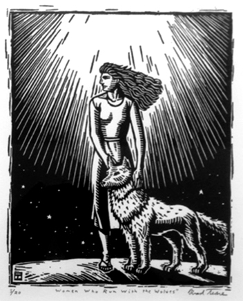
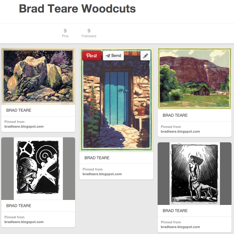
I’m currently preparing for a woodcut show in April 2016 at the Alpine Art Gallery in Salt Lake City. It will be the first time I will have a one person show entirely about the art of woodcut prints. I think it will be a great show and am enthused to make it the best show possible. In preparation I’m planning a series of smaller, more affordable prints. My color woodcuts are outrageously difficult because of the multiple blocks and so most people can’t afford them. I plan to make a series of smaller, simpler prints (possibly hand colored), especially for the show that I hope will appeal to a wider audience.
As I create the woodcuts I intend to post images of my studio as well as the printmaking process. If you are interested you can follow the process on Instagram. The slideshow widget below links to my Instagram site. Let me know what you think of the new project.
FINDING your way as an artist is not easy. As I look back over my career I wonder at all the techniques and styles I’ve explored. I always admired artists who seemed to know exactly who they were and how to express that identity. In retrospect I see I had a propensity for symbolic representation yet rejected it in favor of a more realistic approach. Fortunately, one of the great things about an art career is that it’s never too late to recover lost ground. All the styles and techniques we explore can be plowed under to make rich soil for future work. The ruins of past projects become the stable foundation for future creations. An overview of my career shows a willingness to divide the world into individual, symbolic chunks, while simultaneously resisting such division. The cloisonnism of Van Gogh seemed too prosaicin a world infused with poetic subtlety. Or was infusing symbolism via delineation a necessary aspect of his artistic project? Previously I thought delineation was simply a technique to differentiate areas of color with similar values. The work of Rockwell Kent and the Group of Seven had the same tendency toward symbolism, often using linear calligraphy–and their paintings projected a similar power as the work of Van Gogh. My woodcuts had a type of symbolism lurking beneath the surface although rarely expressing themselves using the overt outlines of Van Gogh’s woodcut-inspired cloisonnism.I now see his delineation as a way to infuse symbolic content into form. So I find myself at a crossroads reconsidering the form of my work–perhaps seeking a synthesis of woodcut and painting–to create a more personal and complete visual world. I feel a new phase of artistic experimentation coming on–allowing prosaic symbolism to step forward, swapping poetry for power–a phase that for the first time I will not resist. Brad Teare– July 2015
AS ARTISTS why do we express ourselves the way we do?
When I was younger I played in a rock band. One evening we were playing to a full house at the aptly named Rogues Inn in Manhattan, Kansas. It was the usual crowd and they were hard to please. We picked a song from one of our own compositions–one that had the vaulting power of the progressive rock of that era. We dove into the tune and found our way through the oft practised song.
But that night something was different. A musical fusion took place that transcended our abilities. When we finished we were met not with the usual smattering of applause but with dead silence. Every head was turned and staring at the stage. After a few heartbeats wild cheers and thunderous applause erupted.
Unlike my bandmates, being a musician was a pastime for me. I really wanted to be an artist. As we basked in the adulation that night I thought that’s the kind of power I want to infuse into my art one day.
My career since then has tried to embrace that kind of vaulting power–but in visual form. Our art can be many things but it is good to know our prime motivations. One reason I like the art of woodcut is that it easily captures the raw power of the artist’s mark. I now see that many missteps in finding a clear artistic path have been from combining two paradoxically exclusive elements–poetry and power.
Artists such as John Twachtman fused their art with a poetic response to nature by using subtle nuances of value and color. Others, such as Lawren Harris, pursued the power of the visual image using divergent contrast and the clash of saturated color. Poetry and power are two ends of a continuum. You can have a mixture of both but you cannot have a mixture of one hundred percent of each quality. You have to compromise. You have to understand the emotional response you are trying to evoke and add the right amounts of each quality to express your intention.
An element of great art is harmony of intent. Not knowing where the emotional intent of your painting is on the poetry/power continuum gives a mixed, and therefore, weak message. Even though viewers may not consciously detect conflict they will react with ambivalence and vacillate between the two emotional poles.
Brad Teare –August 2015
Note: The Lawren Harris book below is pending but I’m enthused to get a copy as I think he’s the best of the Group of Seven. Let me know if you have seen a copy.
ACRYLICS allow me to paint over an abstract as many times as I need to–the surface texture only gets richer. One of the tools I use to help me move forward with a thickly textured canvas is Photoshop (you can also use Corel Painter, Clip Studio Paint, or Procreate if you have an iPad or PC tablet). In the video I use my old ModBook but you can use any tablet that works with your computer.
In the video below I imported the image to the right and began painting over the digital file in Photoshop (the original lacks subtlety of saturation and value). If you aren’t familiar with Photoshop or you need more info on how to make textured brushes I highly recommend the tutorials at the Society of Visual Storytelling. One of the best tutorials on how to make your own brushes is Chaos to Control by Lee White. Don’t let it bother you if your style isn’t similar to White’s. He focuses on making your own highly textured brushes and I found it very applicable to my textured abstracts.
I don’t always use photoshop for corrections but it can be a handy way to pre-visualize what you are trying to accomplish.
I HAVE struggled with lighting in a variety of locations over the years including a basement studio. I’m currently building a new studio and I really want to get the lighting right. I need both good daytime lighting as well as optimal night lighting (I can be a night owl sometimes). For an overview on how to achieve optimal studio lighting click here. After struggling to imagine where to place the windows in the future studio I was inspired by the book Imaginative Realism by James Gurney to build a model replicating widow placement. Using my iPhone I filmed the model at various times of day to see how light would illuminate and reflect throughout the space. This level of previsualization is critical to get a real world idea of how light reacts with the environment. If you need tips and inspiration on how to use modeling for previsualization I highly recommend Gurney’s book. The model helped me avoid several errors–not enough skylights and not enough light toward evening–which I remedied by adding two extra skylights and a tall window on the north end of the western wall. The model also confirmed that the eastern windows, placed at about ten feet off the ground, would allow the exact amount of light needed during morning painting sessions. The video below shows how I observed and improved the lighting possibilities at different times of day. Brad Teare –August 2015
DURING the opening of my abstract show the gallery director for the event suggested I post images of the show on Instagram. Since I didn’t have an account she showed me how to set one up, taking a photo for my profile, and giving me a quick tutorial about hash tags. Before I knew it I had a respectable looking feed and several followers.
Since then the same gallery, Alpine Art, decided to mount a one-person show of my woodcuts in April 2016. The intermittent abstract posts evolved into daily posts about the art of woodcut. I have also posted images of my print studio and equipment and have purposely kept the captions informative but short. So far I have 43 woodcut related posts with 233 images to go (I use the app T-Zero to calculate the days until the show).
I’ve been pleased with the success of Instagram. In a matter of months I have 129 followers. By contrast I’ve been blogging via Blogger for six years and, even though I have over a half million visits, I only have 178 followers. Instagram is primarily a visual medium and is perfect for visual artists. It’s easy to see who is worth following with no obstacles to hitting the follow button.
I do have some complaints–the resolution size on phones is quite small. I wished you could click on the images to get close ups (which you can do on the Saatchi app). I also wish I could track my own likes, like Pinterest, to keep a log of favorite images. They have a like button for connecting with other users but a love button for compiling an archive of your favorite images would be a plus. Although the feed with Instagram is uncluttered I wish you could post with italics, bold, and other graphic flourishes to make the text even more visually engaging. But even as it is Instagram makes Twitter and Facebook look as inviting as a tax form.
Contacting people is not as easy as it should be, either. I listed this blog in my profile and got a message saying it was an illegal URL meaning you can’t have the word blogspot in the address–a futile attempt to make Instagram (which is owned by Facebook) a proverbial walled garden. I got around the lame prohibition by using a Tiny URL address.
One thing I like is posting simultaneously to Facebook with a large image. But simultaneous posts to Twitter are text only which is pretty pointless with a visual medium like Instagram. People can still follow me via Facebook or Twitter, I just post automatically to them via my Instagram account which keeps my life simpler.
I use the app InsTrack to get analytics although it’s pretty clunky and is always needing a buck or two to expand its usability which is hugely irritating. If you know of a better Instagram analytics app please comment below.
In short, Instagram is currently my social media of choice. If you want to follow along click the link to the right of this post. I hope you’ll give it a try. I look forward to your comments either on this blog or via Instagram.
UPDATE: As of August 2015 you can simultaneously post to Twitter with a high resolution image.
I made a new series of videos–one of the first where I show the entire painting process from start to finish. Especially interesting to many will be using a hand held palette. For the first time viewers will be able to see my colors as I hold the palette to the camera as I mix paint. It’s a little awkward but I think you will get the idea. I also draw my sketch on camera directly onto the canvas. Nearly every stroke will be seen in this multi-part series. These two videos are longer than most–nearly 40 minutes total. Please post your questions below. Let me know what you think of the videos.
Your art reflects the energy level you had when you painted it.
“Everything requires Time. Time is the only permanent and absolute ruler in the universe. But she is a scrupulously fair ruler. She treats every living person exactly alike . . . .” –Michel de Montaigne
TIME is often cited as universally constant, often as a goad to the slothful masses toiling away pointlessly earning their daily bread. My perception is that time is anything but constant. Rather time expands or contracts according to our energy. Optimal creativity can only exist during times of optimal energy levels. When we increase our energy we increase our capacity for creativity. So while everyone has the same amount of hours in the day not everyone has the same energy and therefore we have different levels of creativity. When we increase our energy we increase our creativity and our capacity to live a full life. Our art needs to have a high level of energy–if not the viewer will not feel the life and energy you intended and will not be emotionally moved. Norman Rockwell made the analogy between a painting and bouncing a ball off a wall. A ball never bounces off a wall with more energy than it had when it hit the wall. As a painter the energy of your pitch must exceed the energy you want your viewer to feel. Systems drive behavior, therefore we need to devise a system that promotes an energetic life. When we have low energy we ignore life giving habits. We become resentful, bitter, angry, fearful–emotions resulting from fatigue. When we find a way to revive our energy we are kind, courageous, joyful, and invigorated. This state easily affects our paintings and viewers detect the energy just as such personal traits energize those around us. Everything either energizes us or drains us–our energy level is the most important factor to our success. Every artist should understand this fact–time management is energy management. But knowing this equation is not enough–we need to understand it with such passion it changes us. Probably most of us won’t change until the pain of not changing surpasses the pain of changing. But eventually we need to become highly conscious of this important equation–more energy=more life. So what will boost our energy? I need to eat right and exercise regularly. Everyone is different but I can’t surround myself with dark colors and energydepleting images. I need powerful, life affirming imagery. I think it wise to practice a spiritual discipline that focuses on gratitude, peace, and kindness. I also need to keep my studio neat and orderly. Pointless chaos drains me. Who would want a studio in a parking garage? Your studio should exude positive energy so you will reabsorb that energy. Studios, like great works of art, are like batteries–they energize those around them. Collectors realize this and buy the best art and let the life and energy stored in the paintings infuse their daily lives. In like fashion some people and activities drain your energy. Avoid them. Seek people and places that replenish you. Avoid watching TV excessively. Watching TV is not restorative. No one watches TV for an hour and then jumps up feeling totally refreshed. Just like much of our food is not real food, much of our entertainment is not real entertainment–because it exhausts energy rather than restoring it. Seek out social and recreational activities that actually enhance and expand your life. Do not be satisfied with a junk food version of life. Being an artist is not easy. It might be one of the hardest ways to make a living. More than anyone else we need to be intentional about creating an energetic life. Brad Teare –September 2015
HERE are the next to last installments of the four part landscape tutorial. In the last two chapters I fine tune the composition by adjusting values by adding some dark notes and some light passages as well as softening various edges.
This is the most complete explanation of my techniques. Let me know if you have any questions in the comments section below. Many thanks. [NOTE: The final video will post as soon as it uploads to Youtube. It is taking longer than usual and I’m not sure why. Hopefully it will be worth the wait.] Brad Teare –September 2015
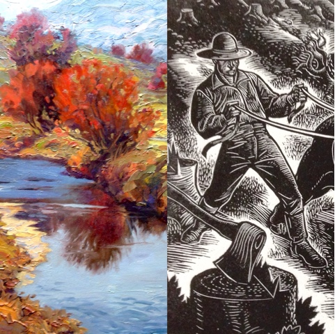
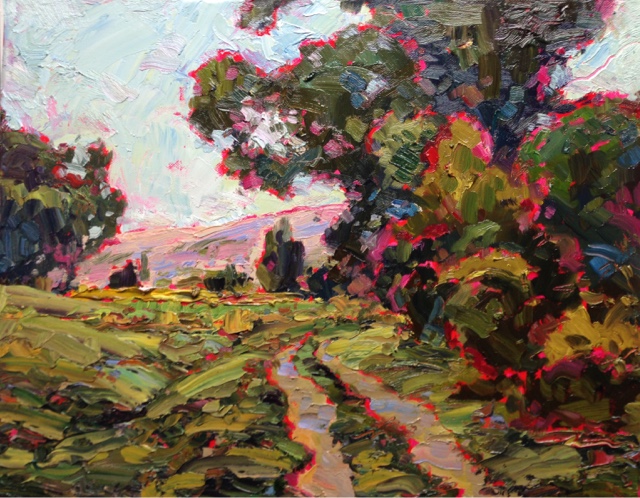
I HAVE often stated that painting with thick paint is like walking a tightrope–there seems to be so much that can go wrong it can feel like you are completely out of control. If you study the paintings of Van Gogh, as well as artists who evolved from his discoveries like Tom Thompson and the Group of Seven, you often observe the use of cloisonnism (the use of line to contain patches of color). So why does cloisonnism emerge whenever painters use thick paint? I’ve talked with artists who love thick applications of color but in order to get the control they need revert to thinner applications. I think the reason Van Gogh used cloisonnism was to retain a sense of control while walking the tightrope of thick paint application. You can observe from his work that the emergence of the surrounding line is intermittent–the line is not uniformly thick nor visible around every form. This thick and thin, vanishing line is what gives Van Gogh’s work form while still retaining a considerable degree of sophistication of texture. Van Gogh borrowed this look from the art of woodcut. Although I’ve been a printmaker for decadesuntil now I haven’t explored this promising technique. In the accompanying painting I added cloisonnism by using a red acrylic marker to draw my motif on gessoed canvas. I then added a thin layer of Gamblin Galkyd tinted with Quinacridone Red. I added local color using brushes and palette knives leaving a ragged line of underpainting around each form. I modified the line by pushing the adjacent color around with a fan brush. Of extreme interest was achieving a degree of success even though I was in a low energy cycle while painting. This safety net–a process that allows for a more relaxed approach–is very welcome. I can see evolving this technique until the line, though present, becomes less obtrusive. This is what I believe the Group of Seven did as the use of line at certain stages of their development is less evident in their work. Brad Teare –September 2015
IN this final installment I demonstrate how I make final adjustments to a painting. In this phase my primary objective it to remove any dots, dashes, lines, or tangents that create compositional elements contrary to my original objective. To accomplish this I need to slow down and carefully analyze the painting. In order to see the painting with fresh eyes I step away from the canvas to get a distant, less detailed view. I might also take a photo. Viewing it on my phone allows me to see it in a new light. I might also dim the lights to get an altered take of the value shifts in the painting. Of course I use my reduction lens as well as a prism to invert the image (you can also use a mirror). Lastly I might turn the painting upside down and peer at it for a while. If I still feel I’m not seeing the painting with a fresh perspective I turn the painting to the wall and let it sit for a few days. If I feel the need to keep the paint wet I will place it in my freezer (that is dedicated to preserving paint–don’t keep paint in a freezer you are also using for food). The freezer will slow the drying time of the thick paint making it possible to paint into wet paint several days later. This video is the shortest of the four because most of the work is simply a series of decisions with lots of time for reflection. Brad Teare –September 2015
A VERY useful medium I use lately is sun oil mixed with about 1/3 Gamblin Alkyd Gel (or G-gel). In the video below I give a very brief demo of how to mix and apply the resultant mixture.
Sun oil is easy to make and requires no specialized equipment. Start by buying a quart of linseed or walnut oil. Walnut oil takes longer to make but will be clearer, having less amber tone. Walnut oil will also dry slower. Pour the oil into a glass casserole pan. I use a pan that measures about 12″ x 18″ and is about two inches high. Add oil until it stands about 1/2″ to 3/4″ in the pan. Place the pan in direct sunlight. Then place a piece of glass over the top. The glass must completely cover the top of the pan. To insure I have a gap, so air can circulate, I take four US dime coins and stick a small bit of kneaded eraser on each side. I then place the coins, kneaded eraser side down, in each corner of the pan. Then I set the glass pane over the pan. The coins will keep the right gap and the kneaded eraser bits will insure that the coins don’t accidentally drop into the linseed oil. Place the pan with the glass on top in a place where it will get sunlight all day. The sun will heat up the oil and will develop a film on top. Be sure to stir the oil once or twice a day so the film doesn’t actually dry. As you mix the thick oil on top into the thinner, lower layers the overall mixture will get thicker with each passing day. In about ten to fourteen days you will have a mixture that is quite thick. Add more days to thicken to your personal preference. I like to get the oil a bit thicker than I need so that when I add the G-gel, which will be slightly thinner, it will be about the thickness of tubed paint. I add the G-gel to prevent the melting that is so common with Linseed and walnut oil. Pure oil will seem like it is staying put on your canvas but in a few hours pure oil will allow the next layer of paint to slide downward. I paint this basically clear mixture onto my canvas when I need to add thick layers of new paint over a dried layer. This technique will allow for wet-into-wet painting even though the bottom layer of paint is dry. Brad Teare –October 2015
IN the ongoing clash between social media a few favorites are emerging for visual artists. I’ve had a Pinterest account for awhile but had not fully exploited its power. Yesterday I added a board (a board is an online portfolio) for my abstracts, my oil landscapes, and my woodcuts. (See my Pinterest Widget below.) I like the design logic of Pinterest which makes Facebook seem like a tabloid. Pinterest is easy and reliable and I love being able to make portfolios of favorite artists and techniques I’m currently studying. To add a Pin button to your Chrome browser to collect images as you browse the internet go here. I originally used Pinterest to make collections of ideas for my studio. I was able to quickly assemble a selection of architectural, lighting, and furnishing solutions. I normally don’t enjoy activities that are too akin to shopping but Pinterest made it fun to both collect the visual information and review it later. In today’s competitive market if social media is not fun it will be obsolete–as I think Facebook will be soon. Facebook suffers from a terminal lack of design and style. Design and style are not simply decoration–design and style are expressions of the logic and ease with which users approach the venue. They are the ambience in which users feel comfortable–or don’t. Facebook is an artless solution that will eventually morph into something else (I suspect it will be cannibalized by Instagram). Let me know how you use Pinterest to advance your painting projects. Visit Brad’s profile on Pinterest.
RECENTLYI needed a thicker oil medium and have been experimenting with sun oil. So far I’ve enjoyed painting with a mixture of very thick sun oil and Gamblin Gel. It can be applied thickly yet stays put on the canvas–it doesn’t drip or sag like many linseed oil mediums.
I came across a DVD by painter Louis R. Velasquez, Painting with Calcite Sun Oil, that recommends using flax seed oil and purifying the oil before sun thickening. After watching the video I’m convinced that purifying, or removing the mucilage, is a necessary step in making proper sun thickened oil.
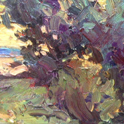
Closeup of oil paint with Calcite Sun Oil medium
Linseed oil is a wood protectant and traditional paint binder. Flax seed oil is typically found as a nutritional supplement in health food stores. Linseed and flax are genetically similar plants. The difference is not in the oil but in the way the oil is obtained from the seed. Food grade flaxseed oil is cold-pressed, whereas modern linseed oil is extracted using chemical solvents and high heat. Flax was bred for making cloth and linseed was bred for high oil content but their oils are identical. Velasquez recommends using food grade flax oil that is unrefined, unfiltered, organic, and has no additives such as lignans.
According to Velasquez you should make sun oil with food grade flax oil because it has not been subjected to high heat and chemical solvents that degrade the oil making it unsuitable for archival painting techniques.
The DVD Painting with Calcite Sun Oil is over an hour long and details a variety of mediums and tips for how to make sun oil as well as Calcite Sun Oil (which I have referred to as putty, although I agree with Velasquez that it’s a harsh sounding word). My favorite part was how to remove the mucilage from flax oil and the random tips such as using a white porcelain tray instead of a glass one to speed thickening, and avoiding using a metal cookie sheet because of later problems with wrinkling. Another fascinating tip was using milk as a fixative and using a straight palette knife for painting (which amazingly I’ve never tried).
I contacted Velasquez with a few questions and he graciously agreed to an interview.
BRAD TEAREI found your DVD fascinating. Thank you for putting the information into an easy to understand format. I previously read about similar ideas but your video shows why it’s important to invest the time to purify the flax oil and why you should start with food grade oil. The footage of the cleansed oil in the bottle versus the uncleansed oil was very compelling. The purified oil was so clear and fresh looking. You stated that you discovered how to use psyllium husk and alcohol to cleanse oil from Francisco Pacheco, the teacher of Diego Velasquez. Did you translate the recipe from the original manuscript?
LOUIS R. VELASQUEZ Thank you for the opportunity to share CSO ( Calcite Sun Oil) with you and your readers. In your intro, you mention the word “putty” as descriptive of Calcite Sun Oil. The word putty is not only harsh–it is misleading.
Historically speaking putty was a mixture of chalk powder and cheap industrial linseed oil (certainly not the superior oil of the Old Masters I describe as all-important to archival oil painting). That obsolete putty mixture of cheap linseed oil with chalk had its use as a glass window glazing compound. In olden days it’s purpose was to keep the rain outside the house. Today we use modern silicone mixtures for our windows.
We fine art oil painters must seek to elevate the vocabulary of our honorable profession. For instance, Rembrandt made oil paint from various colored dirt, yet we don’t use that term, we call them earths. Therefore, I ask artists not to use the term putty (window glazing), nor goop (glue), nor gunk (radiator scum).
Regarding the use of psyllium husk for the removal of the mucilage from the unrefined flax oil I must correct you. I am the originator of using psyllium husk in the cleansing of the oil. You will not find it mentioned in any of the literature of oil painting, ancient or modern.
It happened this way: I’m an older man, I just celebrated my 72nd birthday, and with age comes many health issues. One of mine was poor digestion and my doctor recommended I take Metamusil, an over-the-counter laxative. I read the label and learned it was simply psyllium husk with some sugar flavoring!
One day I saw how a small amount absorbs a huge amount of water. I combined that observation with what I had learned from studying the oil cleansing method of Velazquez’ teacher, Francisco Pacheco, El Arte de la Pintura (1649). Pacheco used liquor and lavender flower buds. In my testing I observed the liquor extracts spike solvent from the lavender buds and fills the oil with hazardous solvent. Since my goal was to create a completely safe, solvent-free oil painting method I had to eliminate the use of the lavender. Luckily, I saw the importance of the psyllium husk. Still, I give full credit to Pacheco for his recipe. He was my guide.
BRADI like the fact that you use food grade ingredients, which makes the formulas more affordable. You describe how to mix the psyllium husk–which you suggest buying at a health food store–with 80 proof alcohol to make the cleansing mix. I assume you buy the alcohol at a liquor store. Adding the alcohol seems like the most expensive step of the process. Do you have a source for the alcohol that is less expensive? Is there a brand of 80 proof alcohol that you recommend?
LOUISThe food grade flax oil is much less expensive than the art store alkali refined industrial linseed oil. I buy a quart of Barleans Flax oil for about $38 a quart. The dry psyllium husk is low cost and a small bag goes a long way. You are correct–the liquor is the most costly. Basic Liquor is made up of two parts, water and ethanol. For the psyllium husk to work correctly it needs water–that’s why I recommend only 80 proof liquor. The proofing is half the number. This means that 80 proof is only 40% ethanol and the rest is 60% water.
We in the US have access to lots of cheap liquor and one can use any clear liquor–be it whisky, vodka, gin, etc. But residents of many other countries pay a very high tax for liquor. After many requests for help I embarked on finding a non-alcoholic method to remove the mucilage. This method is on my website. It is called the CSO Psyllium Husk-AirPump (Velasquez-Tavenier) Method. My friend, Daniel Tavenier, from The Netherlands, inspired this new easy, non-alcoholic method. I will give an important warning: If you decide to use alcohol, do NOT use denatured alcohol (also called rubbing alcohol). It’s fumes are exceedingly dangerous to your eyes.
LOUISThere is no difference. They both are effective. My DVD is a bit outdated now, and I must upgrade it, so I advise readers to read my website for the latest information.
BRAD Have you ever made sun thickened walnut oil? Does it need to have the mucilage removed using the psyllium/alcohol method?
LOUISI also tested raw unrefined walnut oil during my experiments. It has just as much mucilage as does the flax oil. You can use the very same mucilage cleansing methods as with the flax oil. Your readers must take care with the oil they buy, regardless if it is walnut or flax oil . Many manufacturers add anti-oxidants to their oil as a way to keep it sweet tasting. This additive causes the oil to dry very, very slowly. Common anti-oxidants are Rosemary, Vitamin E, Tocopherols, Polypherols. Even Barleans sells a flax oil for pets and it has antioxidants added. Many walnut oils contain added vitamin E.
BRAD I assume that the bleaching and thickening of the oil takes place at the same time. Is it possible to thicken the oil too much? Can it be bleached too much?
LOUISThe flax or walnut oil thickens when exposed to oxygen. If the jar is tightly capped, the thickening stops (if the jar is filled to the top). So yes, the oil can be thickened to excess and it becomes difficult to use. In that case you can add a non-thickened oil to the thickened oil and create an oil with the advantages and disadvantages of both. You can place both oils in a jar, place the jar outside in the hot sun to thin and mix them, or gently heat the jar in a double boiler of boiling water. A little shaking is needed.
The oil cannot be overly bleached. In fact, when the oil is exposed to direct UV sun rays for several weeks it becomes water clear. Then once inside the house it gets a straw color. The test is to put one drop on a pure white ceramic plate and rub it in. You will see it is completely non-yellow and colorless and it will remain colorless.
BRADI noticed you didn’t put a plate of glass over the white ceramic trays with the cleansed oil inside for thickening. Most other methods use a plate of glass over the top. Is there a reason you don’t?
LOUISI used to do that for years using a glass sheet and spacers for air. Then one day–since I live in sunny California with no chance of rain in summer–I discarded using the glass sheet. But if there is a chance of moisture I recommend covering the oil when it is outside. The oil gets full of bugs, leaves and dust, but these are easily filtered out.
BRAD When you described the Calcite Sun Oil mixtures (sun oil with chalk) I was intrigued by the terms Aguado, a thin calcite sun oil mixture, and Espeso, a thick mixture. How thick can you get the Espeso? When it gets thick is it completely opaque?
LOUIS I first heard of adding chalk (Calcium Carbonate CaCo3) to oil paint in 1988 when I bought the first edition of the book on Rembrandt published by the London National Gallery, which scientifically studied Rembrandt’s paint. Rembrandt actually used a chalk-oil mixture as a paint. He created thick impasto translucent bodied glazes with it.
Chalk is only one form of calcium carbonate. Other forms are calcite, marble, aragonite, and limestone. When chalk is mixed with hide glue it is pure white. The Old Masters called this gesso as we still do. If the chalk is mixed with oil it is 98% transparent if the layer is thin. When it is made into a thick impasto it is opaque. When mixed with tube oil paints it makes the oil paint translucent giving it vibrancy.
BRADIf an artist could only afford either the Calcite Sun Oil DVD or the book which would you recommend?
LOUISI recommend them buying the book, and especially the digitally downloadable format. The reason is that the print copy has no index but the digital version does. It is also cheaper AND I will send every book buyer a FREE copy of the DVD via US First class post–at no cost. The instructions are on my website.
BRADThank you so much for both the information in your video as well as sharing your ideas with the readers of Thick Paint! We really appreciate it.
LOUIS I am grateful to you and your website. I’m on a mission to make oil painting safe for all persons. Today, some artists are teaching CSO. One lives in Australia, one in Puerto Rico, one in Brooklyn. Others are indicating interest. You are helping by publishing this wonderful method. Every artist deserves to know the CSO/EMULSIONS method of safe oil painting. Thank you. –Louis Velasquez , San Diego, California Thank you, Louis for your unique contribution to the technique of oil painting. Brad Teare –October 2015
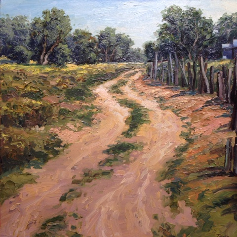
I’VE been having a lot of success with my latest mixture of sun oil and Gamblin Gel. I do a full color, full value underpainting then oil up with the sun oil/G-gel mixture and add the thick paint. It is incredibly fun. The only drawback has been that sometimes the mixture is extremely glossy although if I am careful not to apply it too thickly it is manageable. But lately I have been adding just a hint of chalk (this link is the cheapest chalk I have found). If I add too much chalk the mixture goes milky. I add the chalk just to give a bit of matte finish to what is otherwise a very glossy medium. The chalk also gives just a bit more body to the mixture (which is always good). I could probably get the same results by adding a small amount of wax medium but I haven’t tried that yet. In the accompanying painting I added my final coat of thick paint and pushed the richness of every stroke to the maximum. I intuitively matched the value to my underpainting and then tweaked the color for maximum richness. I deviated from the values of the underpainting but it worked nevertheless (in order to make the colors richer light colors got a bit darker and dark colors got a bit lighter). I find if I adhere too closely to a rigid technique aspects of the painting can suffer. Be sure you remain open to creative possibilities as you paint. This will come easier as you get more experience and let your subconscious mind do the heavy lifting. Brad Teare –November 2015
 On the evening of 7 July 2015 the Thick Paint YouTube Channel clocked over a million views since the first video posted on 20 November 2009.