When I was moving into my new studio, I rediscovered the charts in the corner of my closet. I placed them on a shelf underneath my wall easel. With the charts nearby, I found I began to refer to them as I planned the color for my paintings. With a modest amount of planning, I found I was avoiding color clichés, and my color became more varied and vibrant.
 As prescribed in the book each chart used a single color which I mixed with all the others colors on my palette. I would then add this mixture with white. The colors shifted from left to right as I added other hues. The swatches shifted in value from top to bottom as I added white.
Initially, I didn’t understand the purpose of doing color studies. Much like doing value studies you have to have faith. You have to believe the process will produce results–without short-term evidence. I can’t explain why doing value or color studies results in better paintings. You have to keep experimenting with a principle even though you see minimal results. In some cases, the hoped-for breakthrough happens after months of seemingly nonproductive experimentation.
This process can be challenging to explain to the beginning painter. If I were to graph the progress of such experimentation, it would be a hockey stick. It would show months of no progress followed by an instantaneous rise in ability.
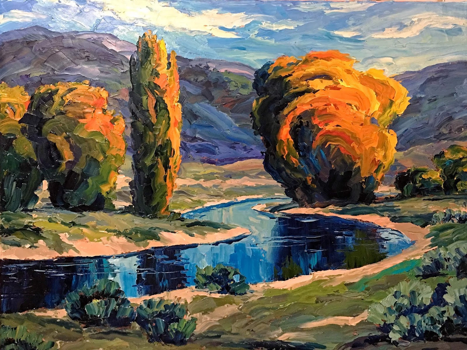
HOW I USE COLOR CHARTS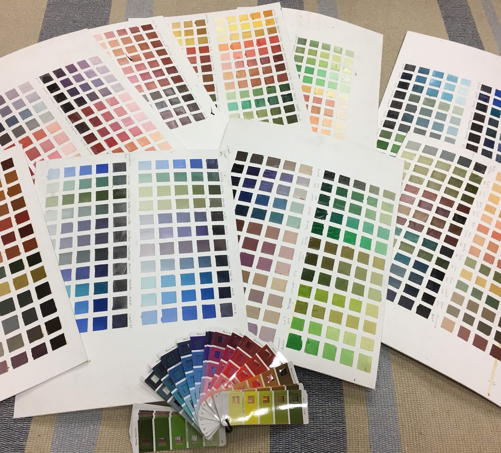 I almost always do a watercolor sketch before I transfer my design to canvas. The quick sketch allows me to imagine the chromatic direction the painting will take. I select colors by asking a series of questions. What emotional effect am I trying to achieve? What colors will be in opposition to the primary color? What harmonious accents will complement those main colors? To clarify my thinking, I shuffle through my color charts. Such a review breaks up habitual color mixtures allowing me to select basic colors. Do I want to mix my greens around a base of Burnt Sienna and Thalo Blue? Or would a base of Cadmium Yellow Light and Ultramarine Blue be more appealing? The pause to consider the basic colors allows me to simplify and harmonize.
 After selecting basic colors, I sketch in my watercolor sketchbook. I then dash in the planned colors. It can be difficult to discipline myself to use only the colors I have preselected. But the results prove to be well worth it.
Finally, I have to carry the discipline over to my oil palette. I keep both the watercolor study and the relevant color charts handy. The inconvenience of adhering to a plan is outweighed by positive results.
By combining color charts with watercolor sketches, you can avoid routine colors schemes.
If you need a good watercolor set for doing sketches I highly recommend this versatile, inexpensive kit. The commercial color swatches in the photo can be found here.
Brad Teare, November 2018
Buy Brad’s Art Online Today
Updated: 13th July 2026
