 |
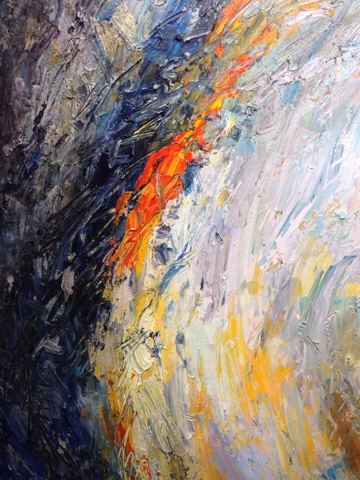
| Closeup of a recent acrylic painting, Turn To Light, 48″ x 36″. |
WHEN things go bad with a painting negative voices sound off in my head. When I’m painting with acrylics such voices usually repeat worn out phases such as “what do you expect using plastic paint”, or similar comments delivered with an internal, imaginary smirk. Such phrases can be traced to teachers or peers who claimed that acrylics don’t have the depth or, more elusively, the quality of oils.
Yesterday I heard such voices as a large acrylic painting started heading south. But my experience is that many of the so-called defects of acrylic arise from handling it as if using oils. I find there are no intrinsic defects with high quality acrylics. The defects are imaginary or arise from misunderstandings of why the paint is misbehaving.
High quality acrylics and oils are both just pigments mixed with a medium. In the case of oils it is usually linseed oil. In the case of acrylics the medium is acrylic polymer and water. If you take both mediums and let them dry on a sheet of glass you find little difference–except the linseed might be a little warmer and the acrylic will dry slightly thinner with a glass-like clearness. This demonstrates that the two mediums dry similarly. So why the controversy over the quality of acrylics?
The primary misconception is that acrylics dry muddy or flat. This flatness results from the quicker drying time of acrylics. The standard method of loading the brush in oils is to swipe the brush through piles of paint with the oils remaining wet throughout the painting session. Using this method with acrylic paint will result in less intermixed color since thin, stray acrylics tend to dry on the palette and not intermix. To foster vibrant color you need to allow shards of color to randomly intermix (even if this intermixture appears on a nearly microscopic level). Muddy color means little or no optical vibration within that color or color field.
The same amount of acrylics on the palette and identical methods of mixing the acrylics results in a less intermixed appearance. The shards of random color that oil painters get are essentially field effects that energize the paint. The fact these bits of color are harder to foster in acrylic should not be held against the pigment–especially when some painters are oblivious to the phenomenon. The solution is to use more paint on the palette (larger dollops dry slower), be sure to keep the central mixing area wet (usually with a mister), or use a brush loading system that guarantees broken color (see this blog entry).
Another complaint is that acrylics don’t have the depth of oils–meaning it doesn’t have the gloss or glow of oils. Oils have glow and gloss because as they dry the linseed oil comes to the surface as the heavier pigments sink. This gives a naturally occurring gloss of color. This layer of oil will also tend to be yellow (from the thicker layer of oil) giving the surface a mellow appearance. This glowing, mellow affect can be added to acrylics by adding a gloss surface after the painting dries or adding it to the paint beforehand. If you add a slight bit of Hansa Yellow to the glossy additive (like gloss varnish or Clear Tar Gel) you can achieve identical results.
Another complaint is that acrylics don’t have the body of oils. The reason is that acrylics contain water in the acrylic polymer. Water is a less viscous medium than linseed oil and gives less friction to your brush. The solution is to add a thickening medium to the acrylics such as molding paste. My favorite is Golden Colors’ Coarse Molding Paste. Adding pastes, which have additives like marble dust, will diminish the gloss so if you desire the glossy depth of oils be sure to add a little gloss medium (my favorite is Tar Gel).
Many artists exploit the qualities of acrylic to get matte finishes that have very little microscopic field effects. This is an entirely justified use of acrylics. But it is unfair to condemn acrylics just because they don’t behave like oils.
I’m like most artists–I ascribe a host of virtues to paint that probably don’t exist. For example, I think Golden Color’s acrylic Cobalt Blue has near magical properties. If a painting is failing I feel I just haven’t added enough Cobalt Blue. Although such obsessions can be charming and nearly everybody needs a lucky charm on occasion, such irrational ideas, when they turn negative, need to be exposed for what they are–irrational prejudices that harm unfettered exploration of paint.
Brad Teare –January 2016
Buy Brad’s Art Online Today
Updated: 4th March 2025